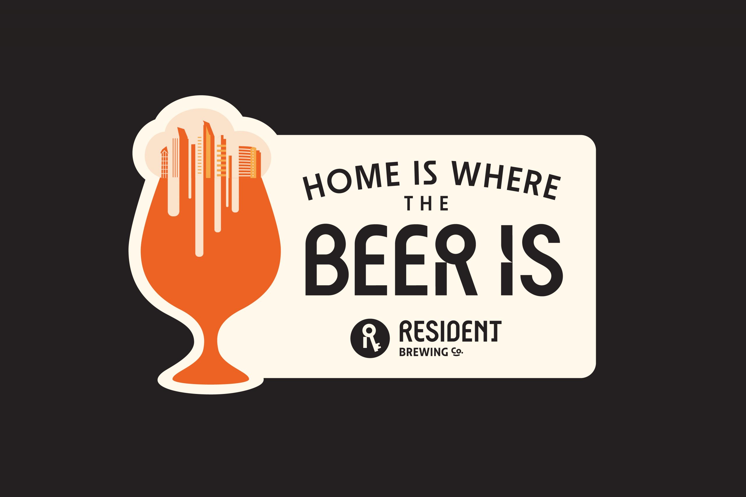
Home is where the beer is
Home is
where the beer is
Client
Resident Brewing Co.
Year
2024
Services
Brand Strategy, Research/Insights, Positioning, Brand Story, Tone of Voice, Tagline, Messaging, Visual Identity, Design System, Art Direction, Illustrations, Packaging Design and Brand Book
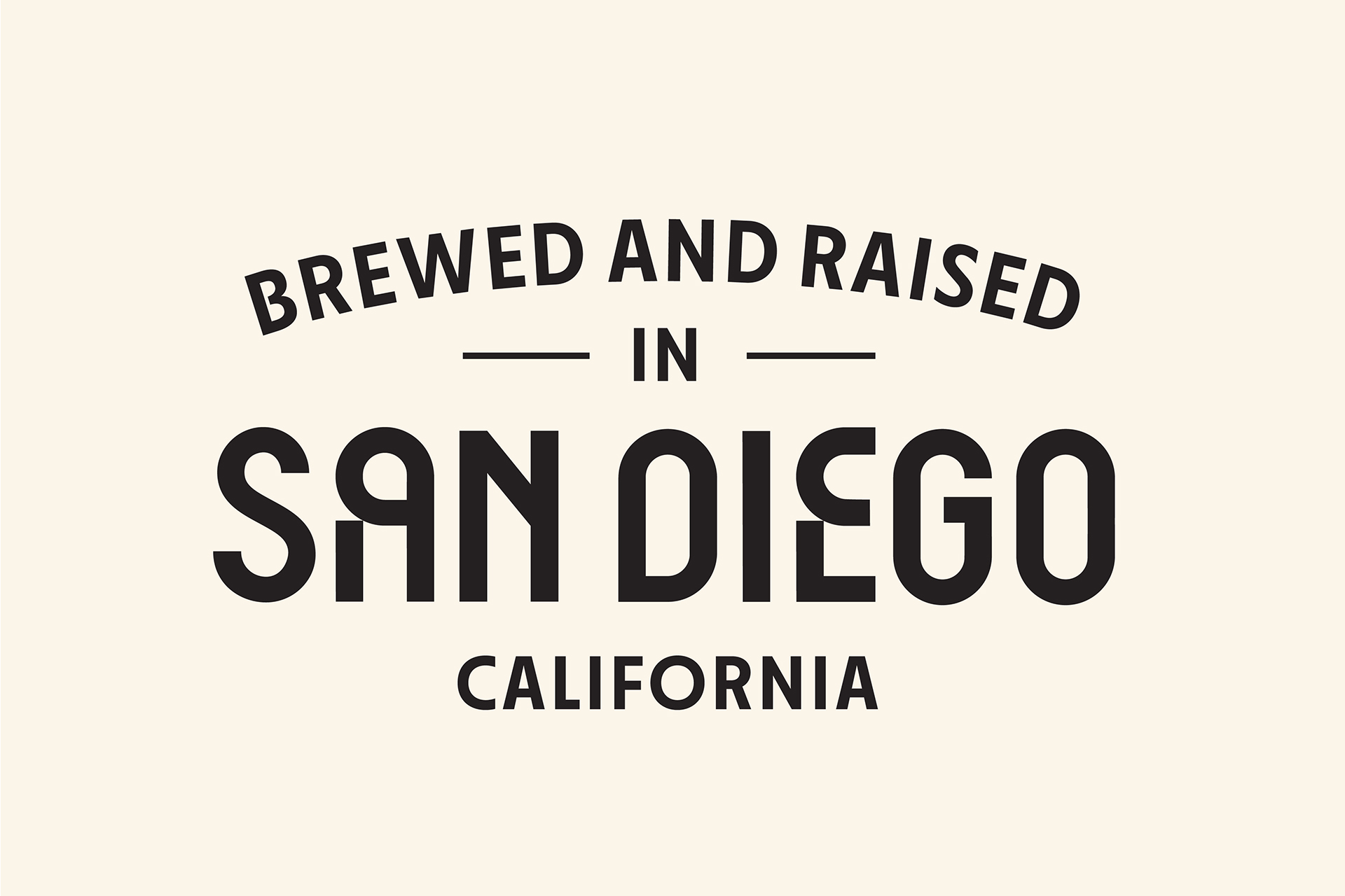
Right in San Diego’s bustling heart, Resident Brewing Co. is not just a brewery but a vibrant community hub, blending passion with hops. Our rebranding journey aimed to capture this spirit of inclusivity and fun, ensuring the brand’s essence shines through in every aspect, from sip to community connection.
Challenge
Challenge
Updating Resident Brewing Co.’s identity meant balancing modern appeal with the rich heritage that’s won the hearts of San Diego’s craft beer enthusiasts. We sought to give the brand a standout, contemporary look without sacrificing its core values of craftsmanship, community, and passion for brewing.
Solution
Solution
We took a comprehensive approach, refreshing everything from the brand’s voice and look to its packaging. Our goal was to craft a brand experience that felt welcoming and familiar to all, ensuring Resident Brewing Co.’s legacy of uniting people through exceptional craft beer continues.

Visual and Verbal Identity
Visual and Verbal Identity
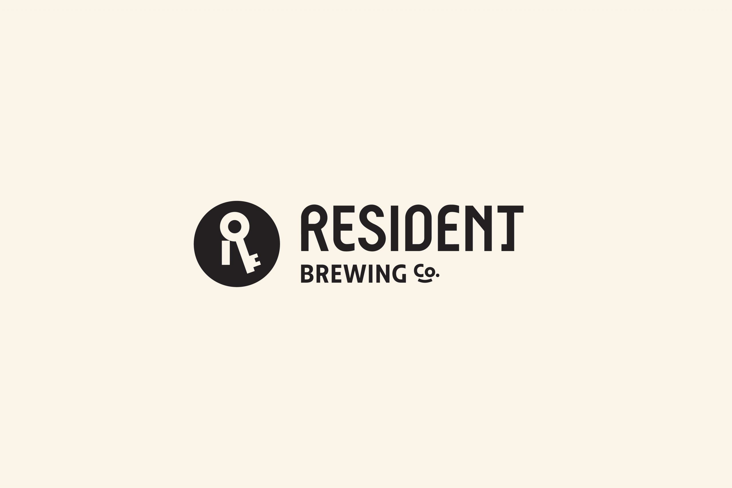
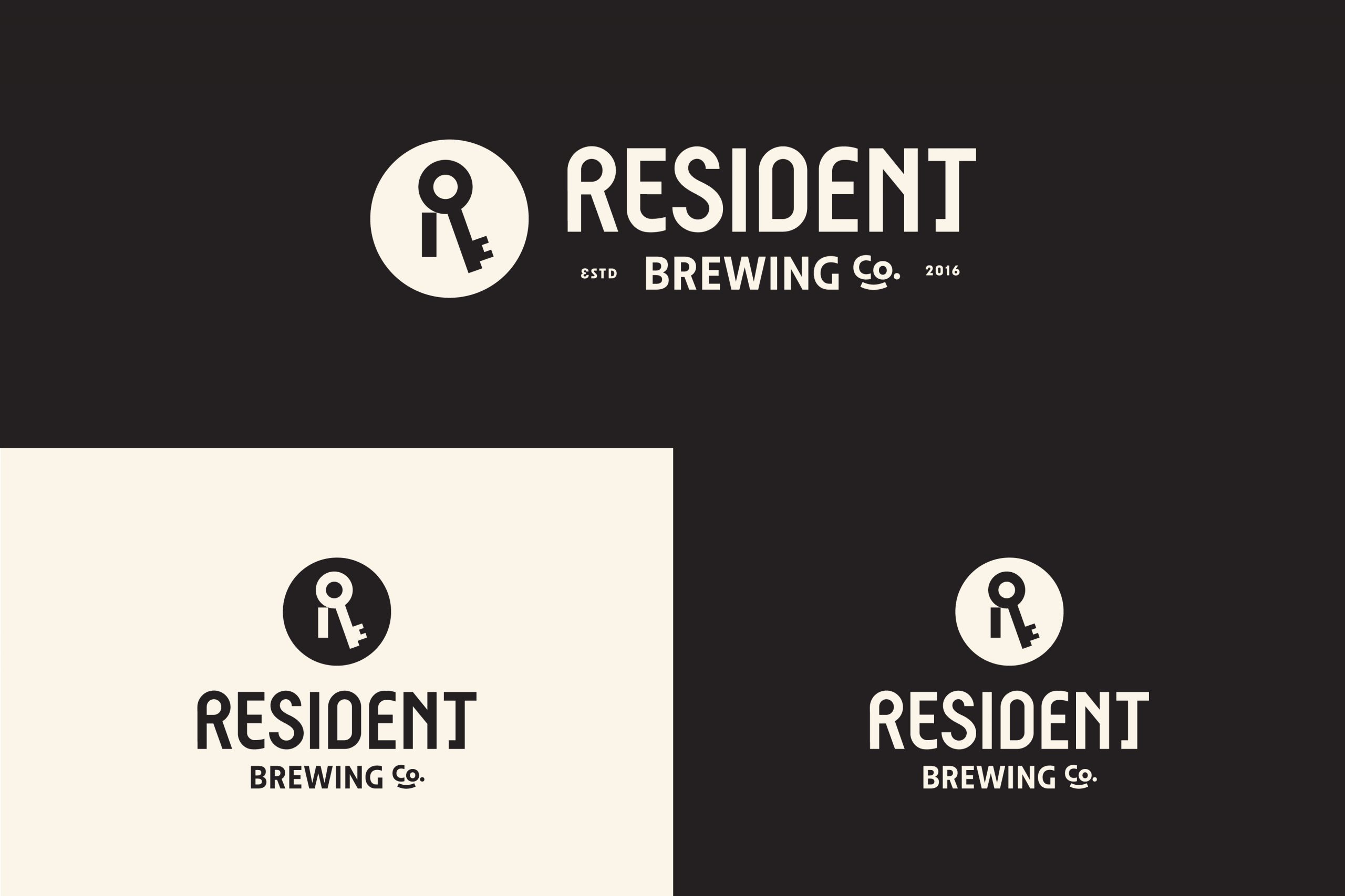
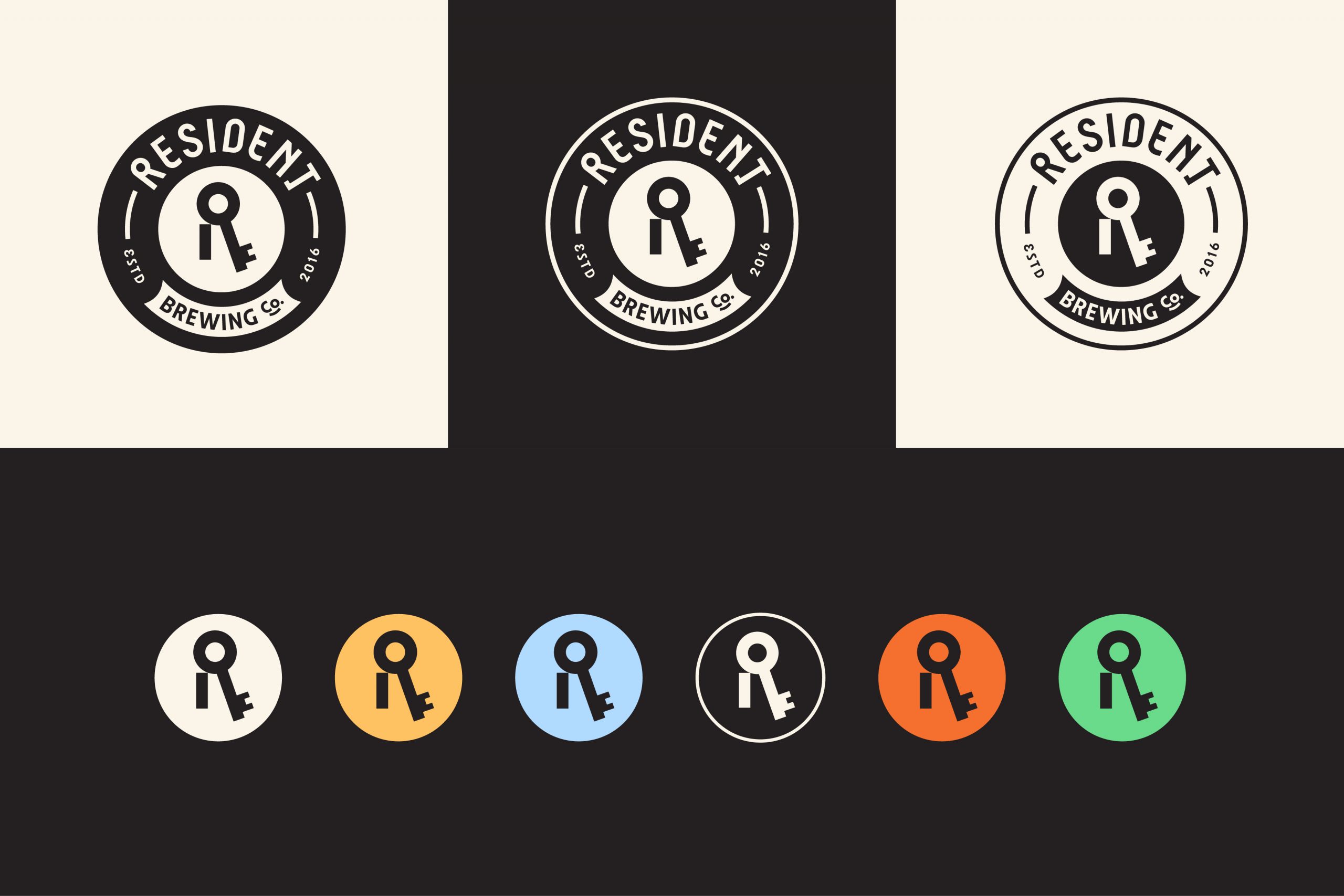
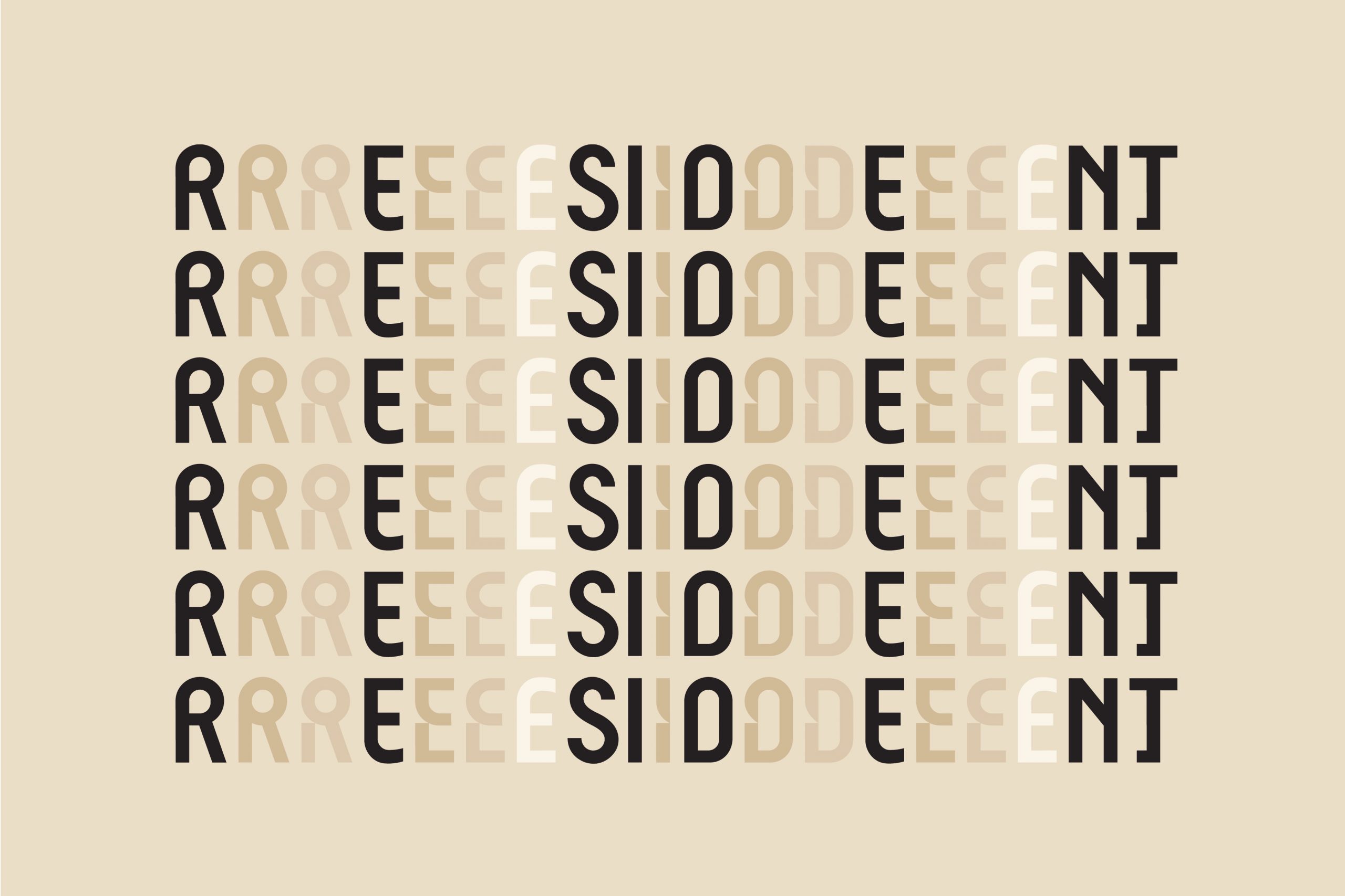
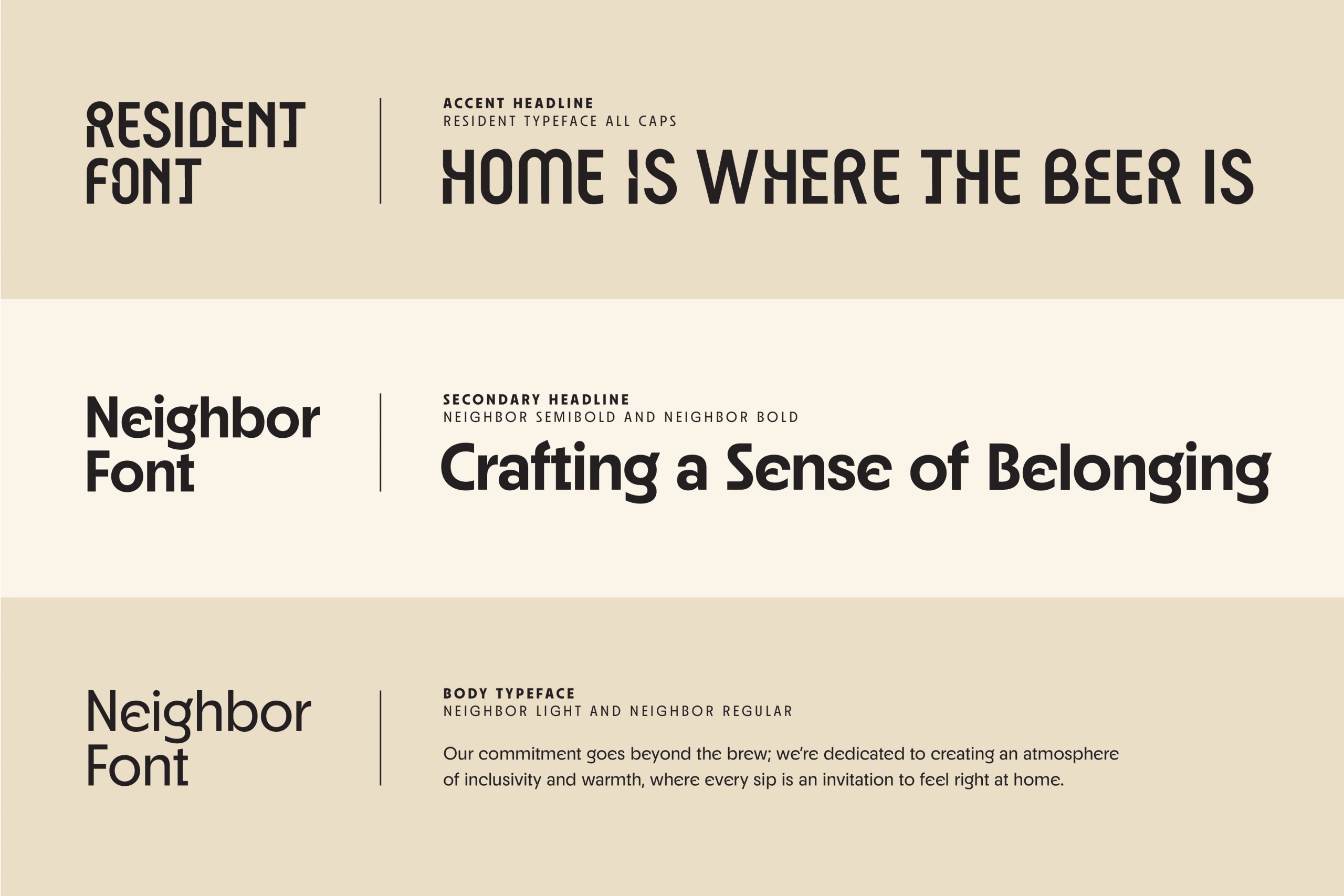
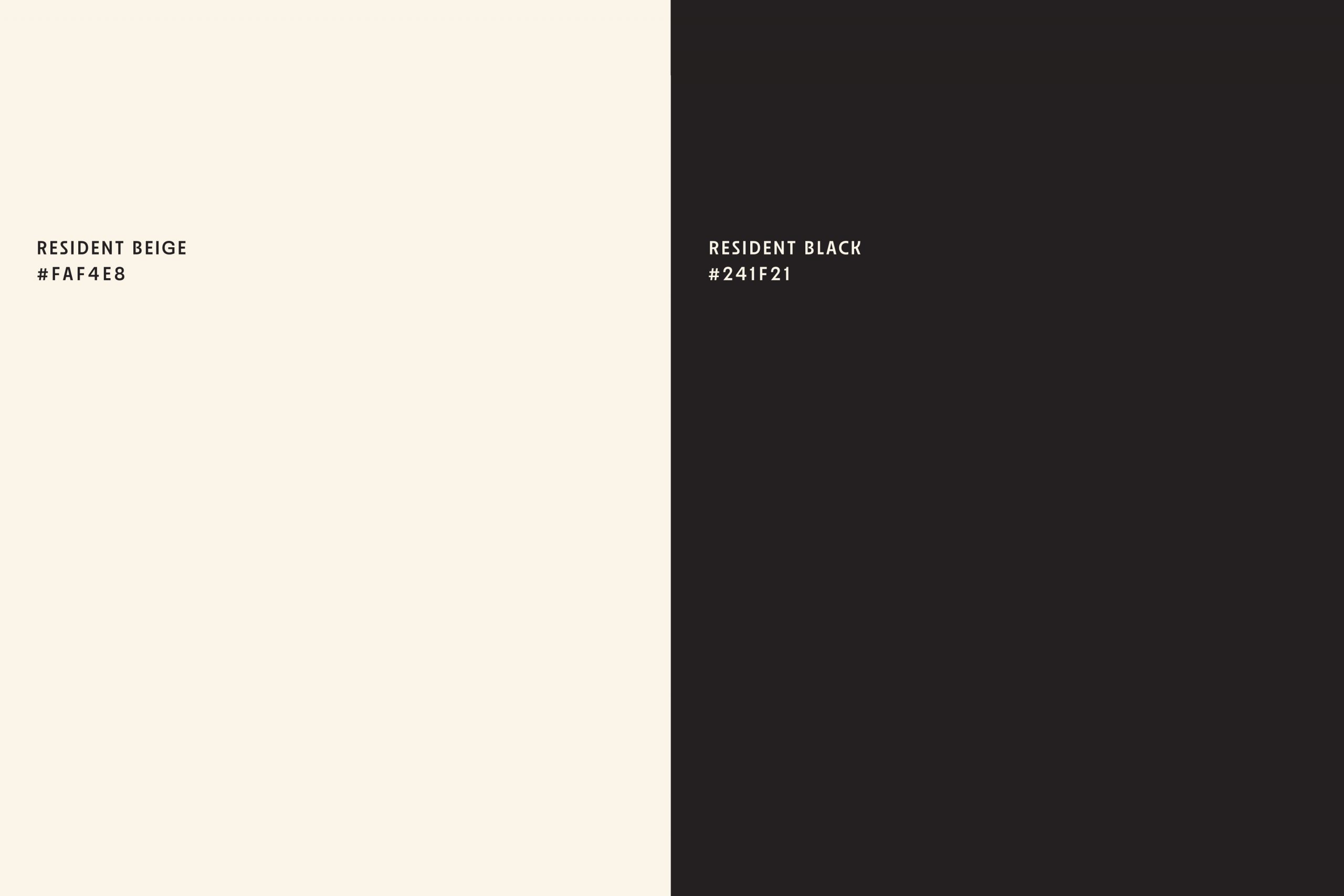
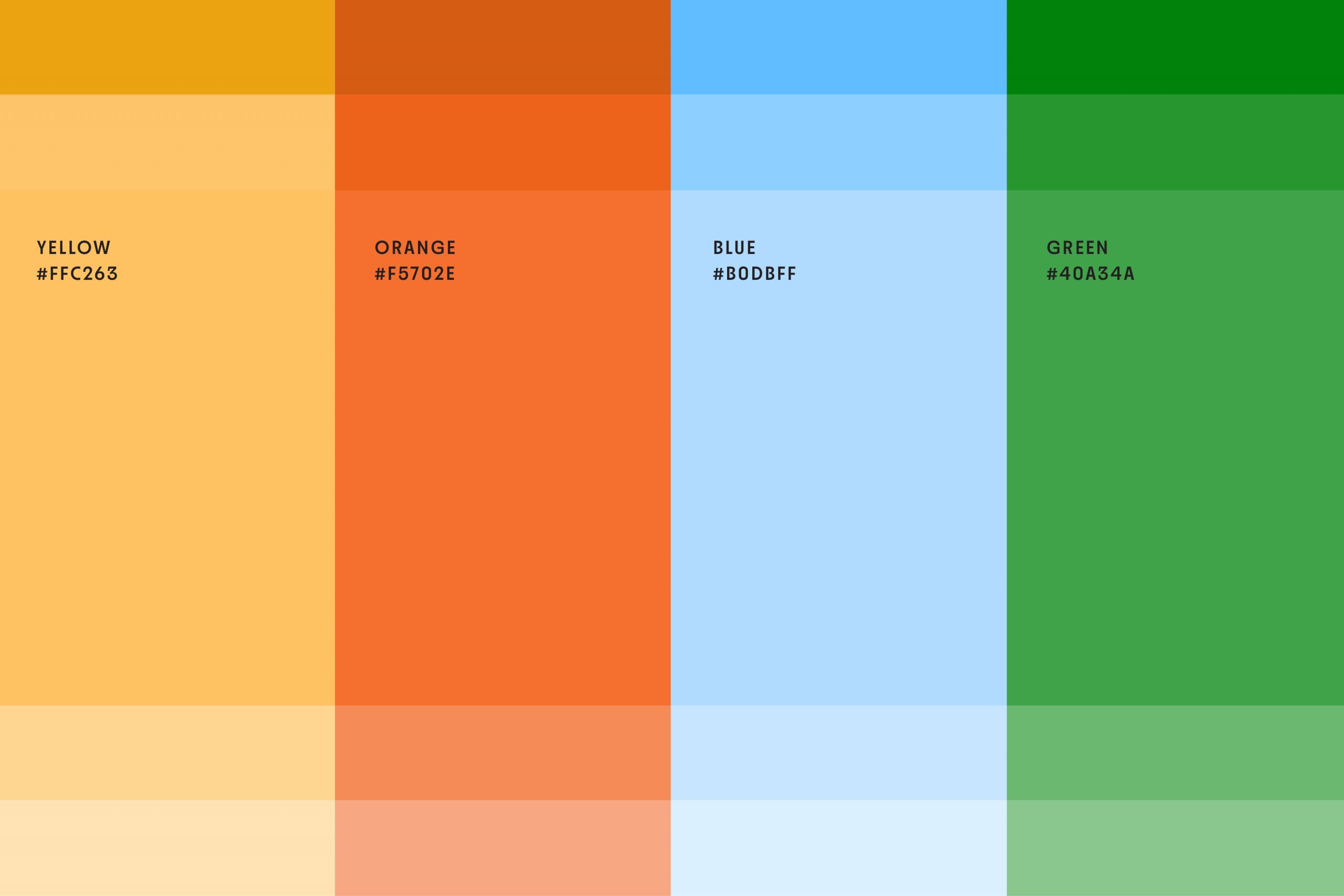
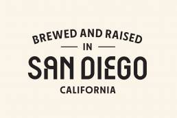
Our visual identity revamp was anchored in a bespoke font a distinctive choice that sets Resident Brewing apart in the brewing world. The simplified key symbol, representing the brewery’s welcoming nature, became a central icon. The color palette was carefully chosen to start with charcoal black and off-white, expanding to vibrant hues inspired by San Diego’s landscape, emphasizing simplicity, authenticity, and freshness. This approach ensured that the visual appeal remained vibrant and engaging.
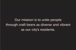
We refined the brand’s story, promise, and slogan to mirror its mission: to unite people through craft beers as diverse and vibrant as the city’s residents. The narrative we crafted was inclusive, authentic, and friendly, inviting everyone into the Resident Brewing family.


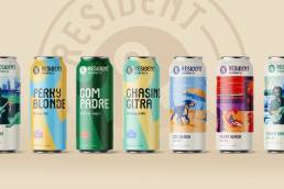
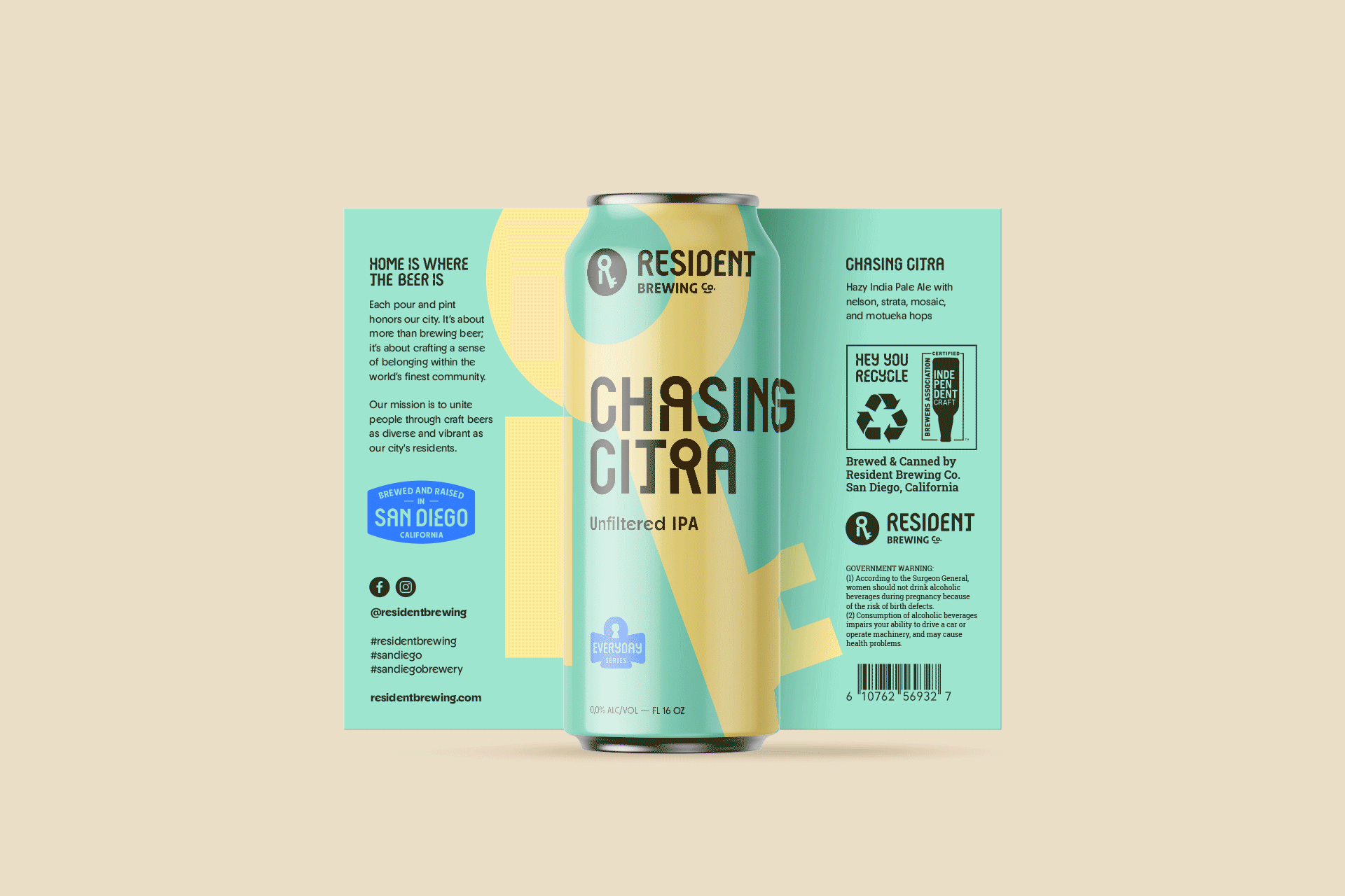
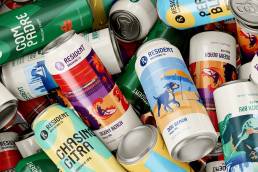
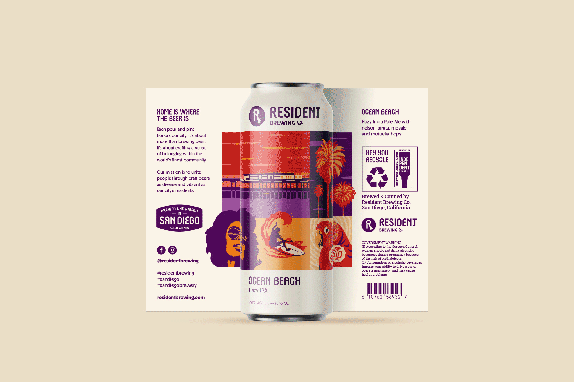
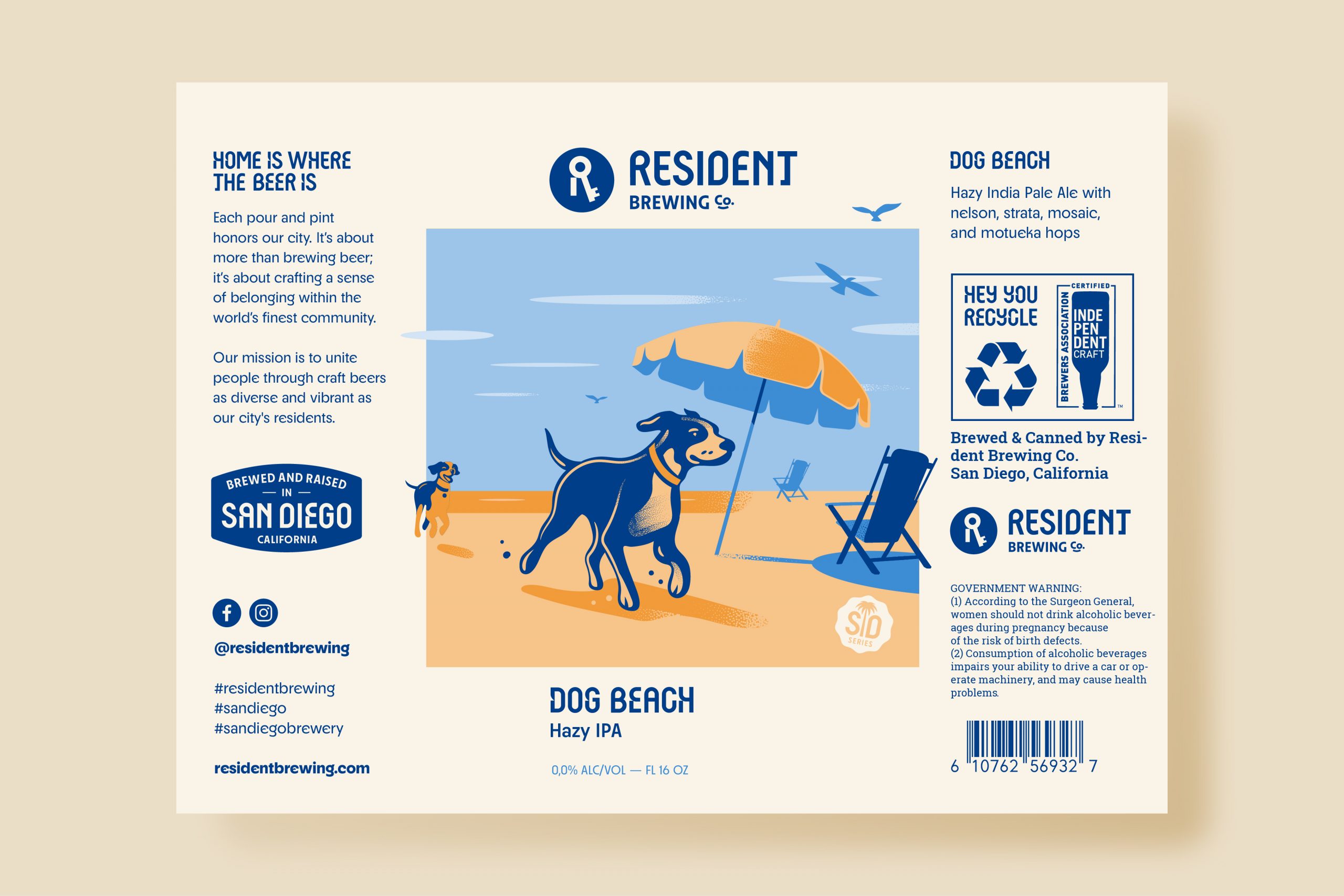
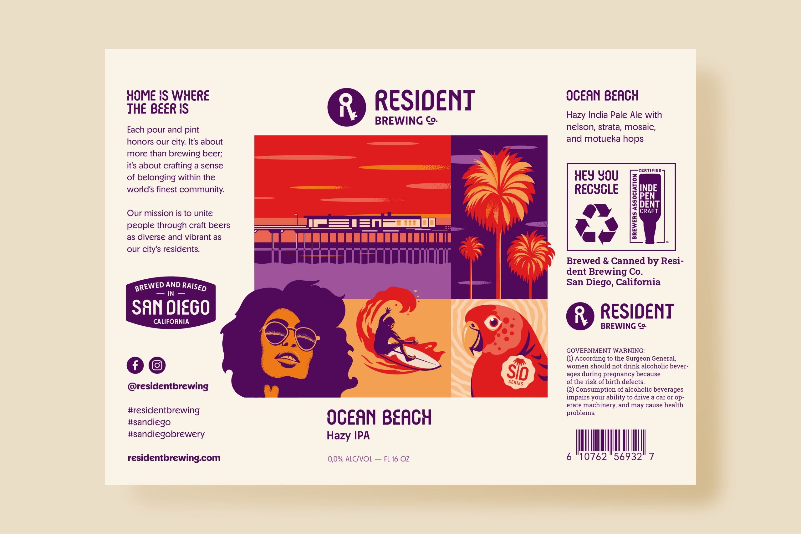
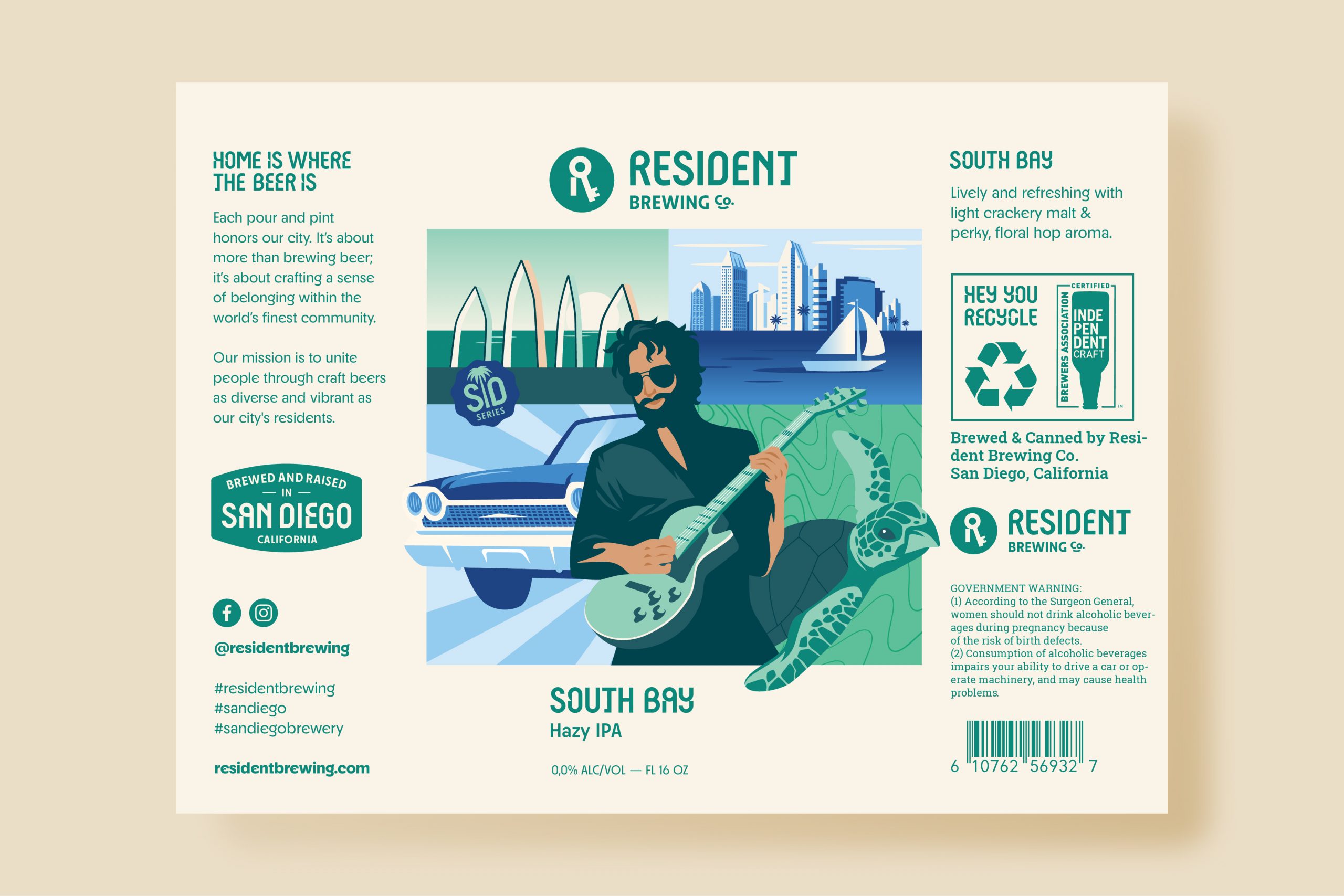
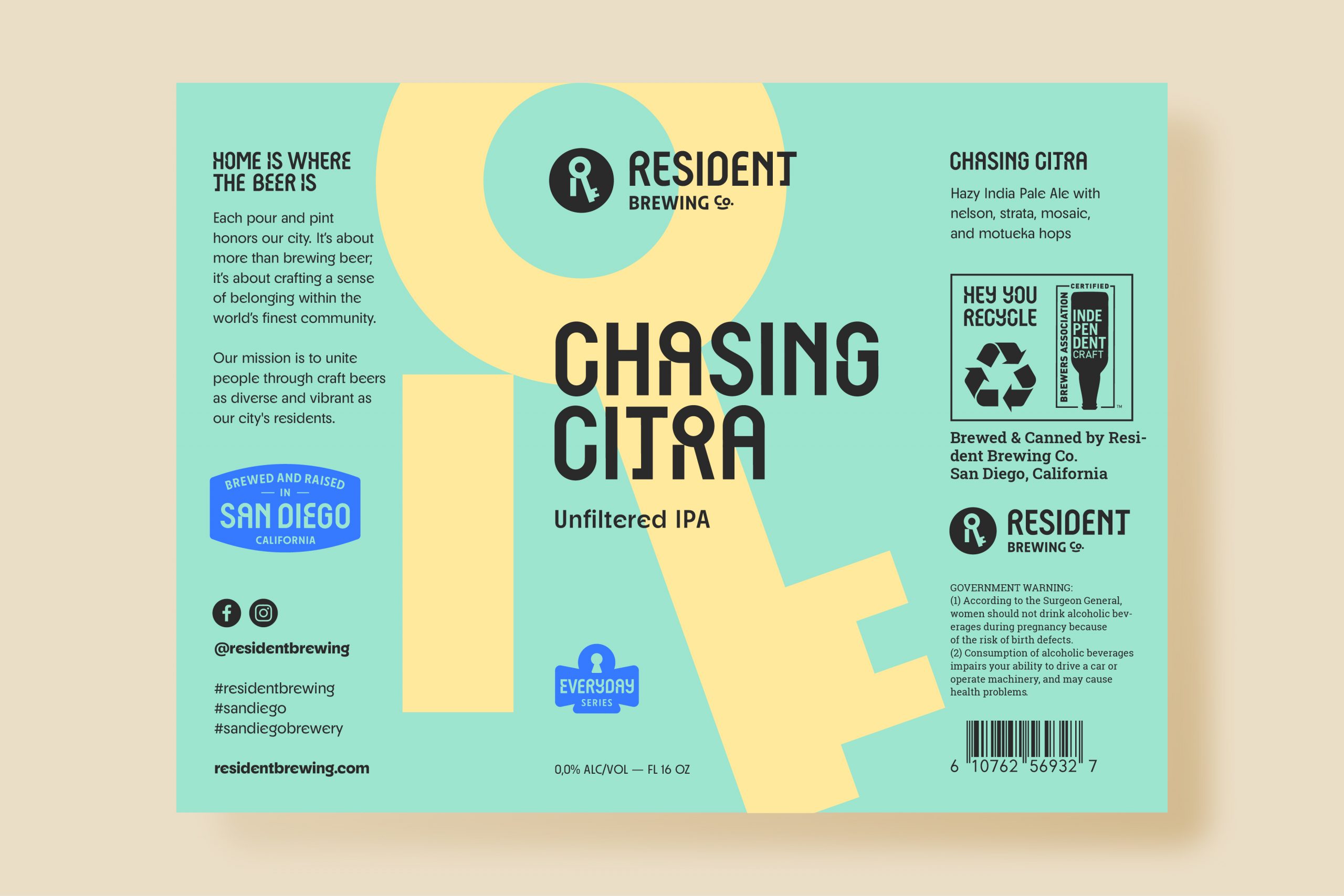
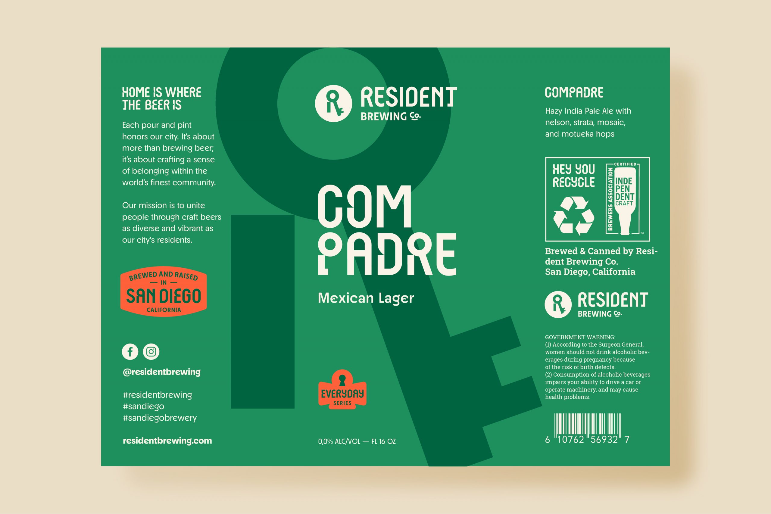
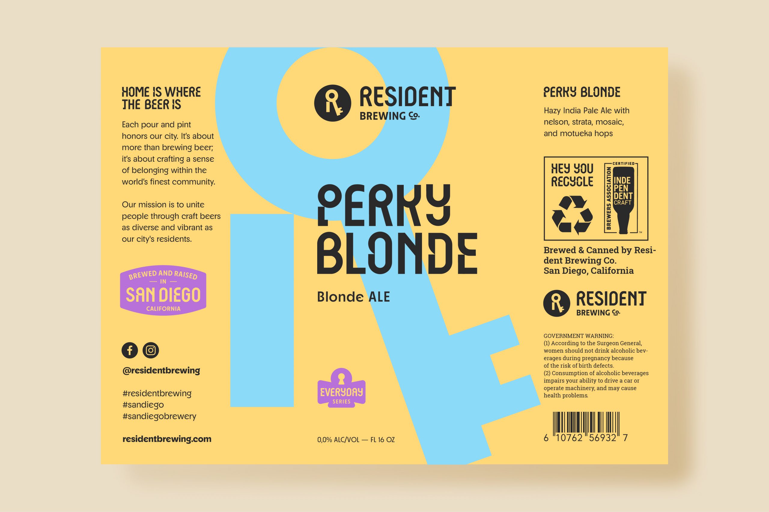
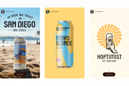
Packaging Design
Packaging Design
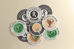
Our design strategy for Resident Brewing Co.’s labels and templates was both creative and detailed, tailored to highlight the distinct features of each beer type—core, seasonal, collaboration, or specialty. This approach not only makes each beer recognizable but also strengthens our brand identity with consistent design.
We also added stamps to our labels, serving two key purposes: they guide consumers through our wide range of beers, making it easier to find their favorites, and they connect customers with our beers by sharing each one’s unique story and qualities. These stamps symbolize our dedication to quality and our commitment to bringing people together through our craft.

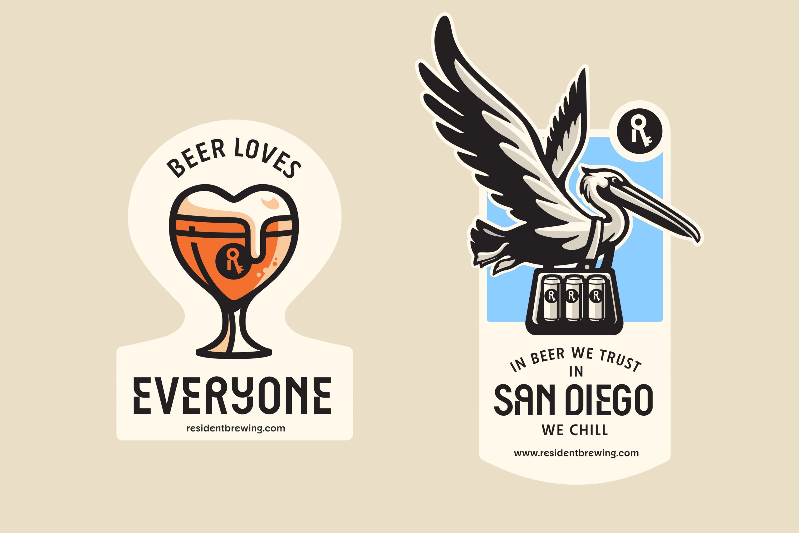
Illustrations and Stickers
Illustrations and Stickers
Our stickers are a key part of how we express our brand, adding personality and style that truly captures what Resident Brewing Co. is all about.
These vibrant visuals do more than just look good—they celebrate the fun, creativity, and community spirit at the heart of craft beer making. They make every moment with our products special and share the story of Resident Brewing Co., inviting everyone to join in the passion and care that goes into every brew.


Conclusion
Conclusion
This rebranding not only refreshes Resident Brewing Co.’s identity but also deepens its commitment to community and craftsmanship. By weaving together a vibrant verbal and visual narrative, we’ve highlighted the essence of togetherness and the spirit of San Diego. Cubic Orange is proud to have guided this transformation, ensuring “Home is where the beer is” transcends beyond words to become a lived experience with every sip. Here’s to shared moments and lasting connections.


Better Clients
“The Cubic Orange creatively combined their passion & attention to detail while asserting direction as needed when our own team was rudderless. They get that less is more and they know that simple is very hard, but nailed it for our brand at Resident Brewing!”
MARTY OCHS
The Resident Brewing Co. President