Major Peters
Major Peters Rebrand:
Make It Major
Client
Golding Farms Foods
Year
2024
Services
Brands Strategy & Positioning, Research & Insights, Verbal Identity, Visual Identity Design, Design System Creation, Art Direction, Custom Illustration, Photography Direction, AI generated content, Sonic Branding, Brand Guidelines, Packaging Design, Sales & Marketing material
A Bold Vision: Reinventing an American Classic
Major Peters, a Wisconsin-born brand with a 60-year heritage, challenged us to revolutionize the Bloody Mary experience and grow from 0.3% to 5% market share in five years. Through strategic research, consumer insights, and brand development, we transformed the dormant brand into a culturally relevant category challenger.
From Military to Modern: A Brand Evolution
Major Peters faced a turning point, with its military-themed image and low 0.3% market share failing to connect with modern consumers. In-depth market analysis revealed the need for a rebrand that honored its Midwestern roots while appealing to brunch lovers and tailgaters, standing out in a crowded mixer category.
Discovering Major Potential:
The Strategic Shift
Through extensive discovery sessions, market research, and consumer insights, we uncovered a powerful opportunity. Our analysis revealed shifting consumer behaviors in the mixer category: a growing preference for premium ingredients, the rise of brunch culture, and a desire for authentic brand experiences. Competitor analysis showed a category stuck in traditional positioning around product attributes, leaving space for an emotionally resonant brand.
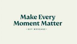
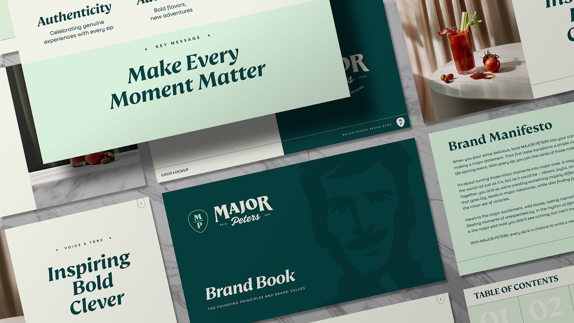
We embraced a bold new direction with “Make Every Moment Matter” as our guiding light. By transforming Major Peters into an adventurous Explorer with a dash of playful humor, we created the “Make It Major” positioning. Our focus turned to brunch lovers, tailgaters, and day-drinkers who value authentic experiences and shared moments. This strategy emphasized premium quality and the power to turn ordinary occasions into adventures.


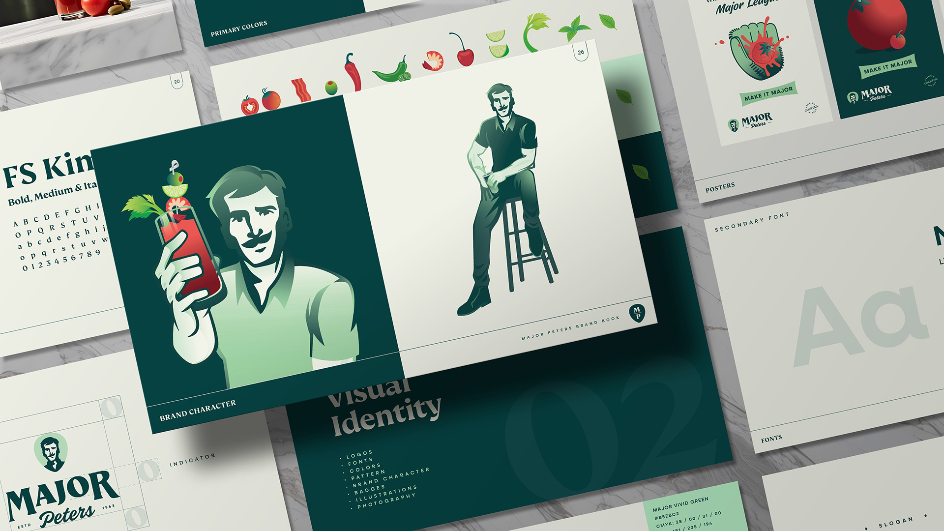
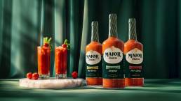
From Symbol to Story: Crafting Visual Impact
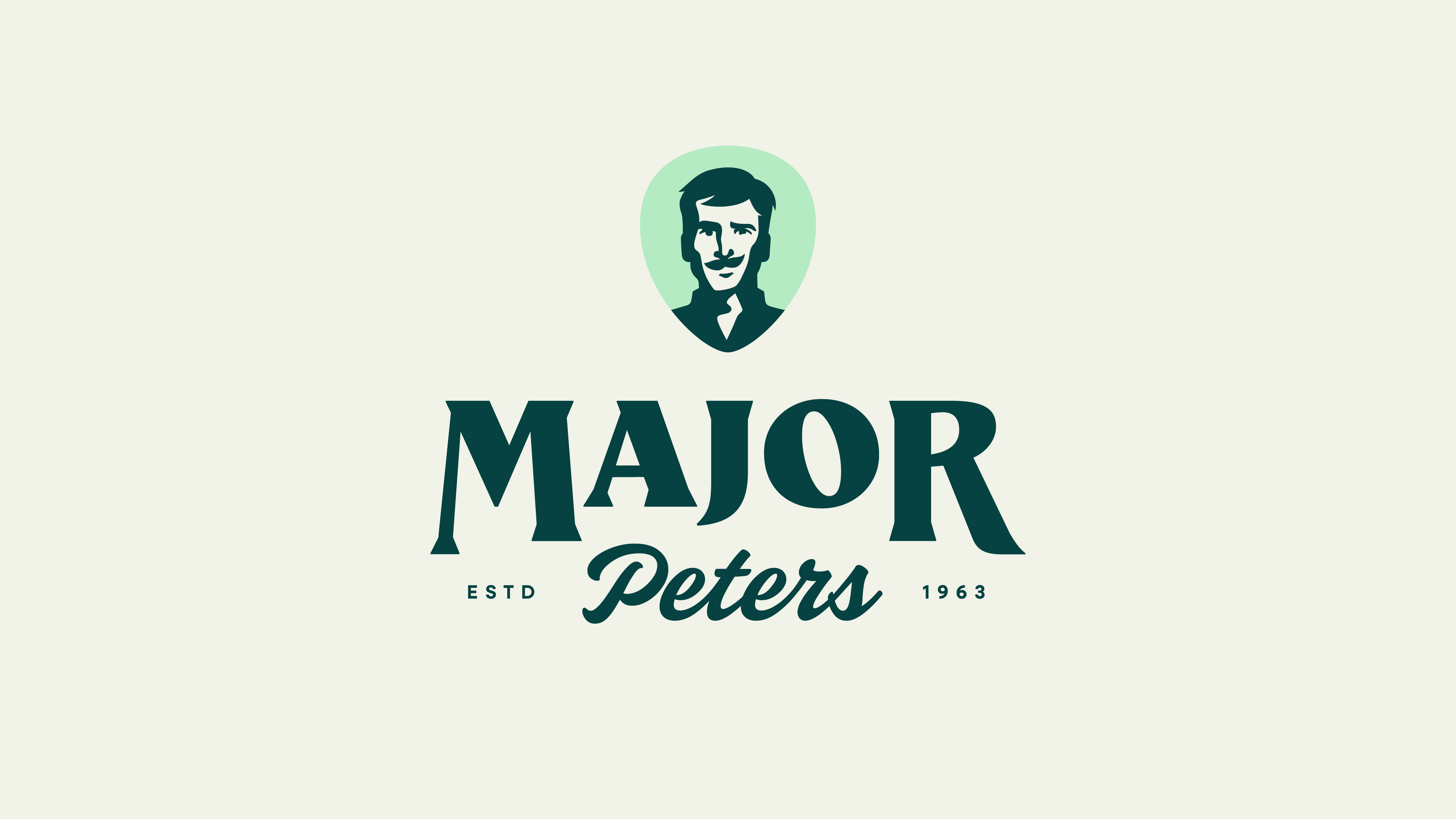
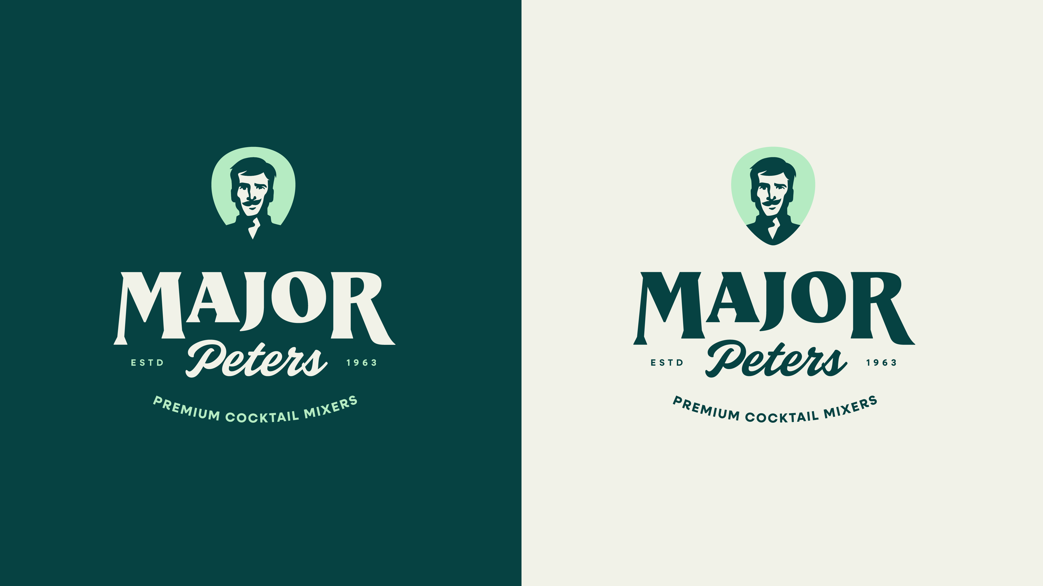
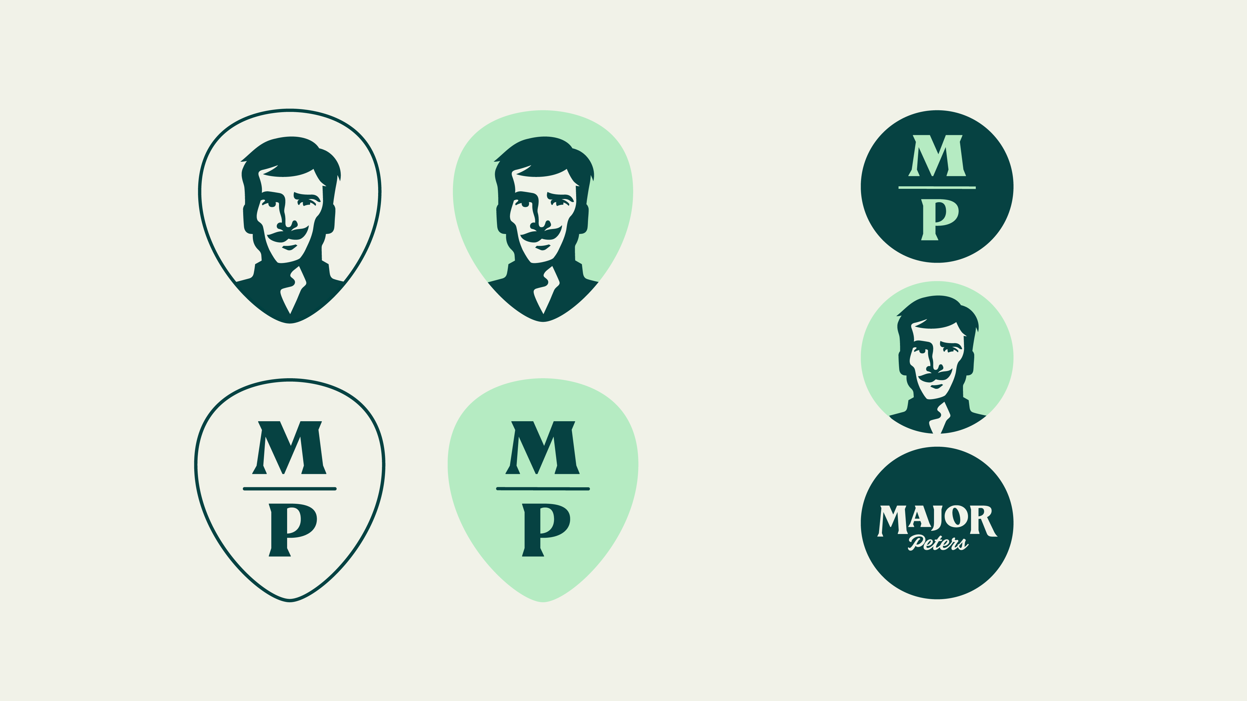
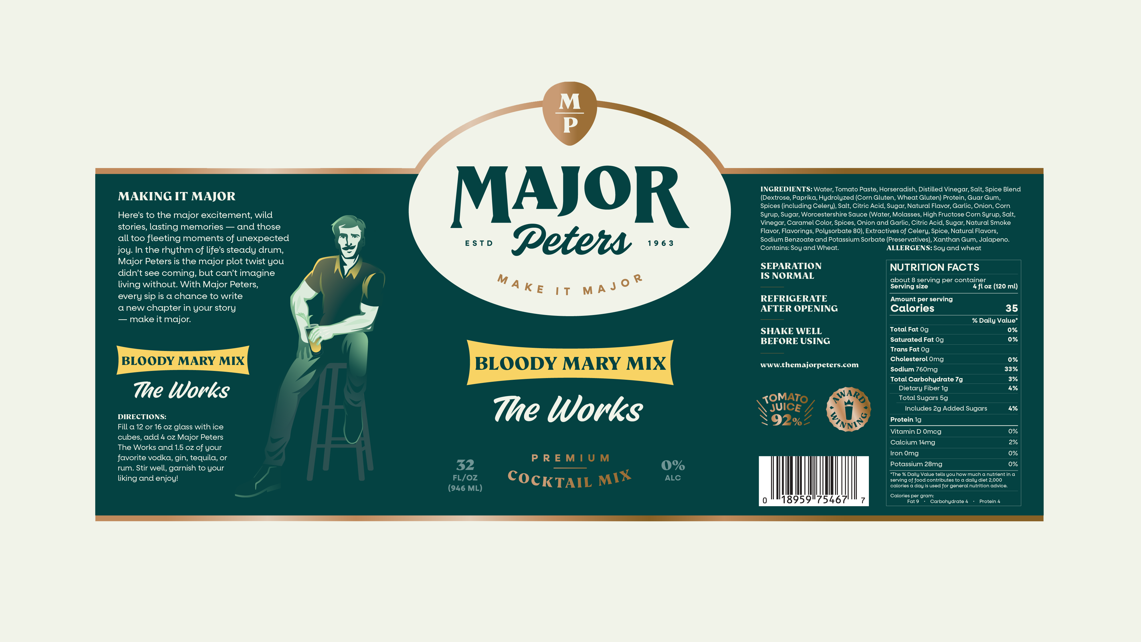
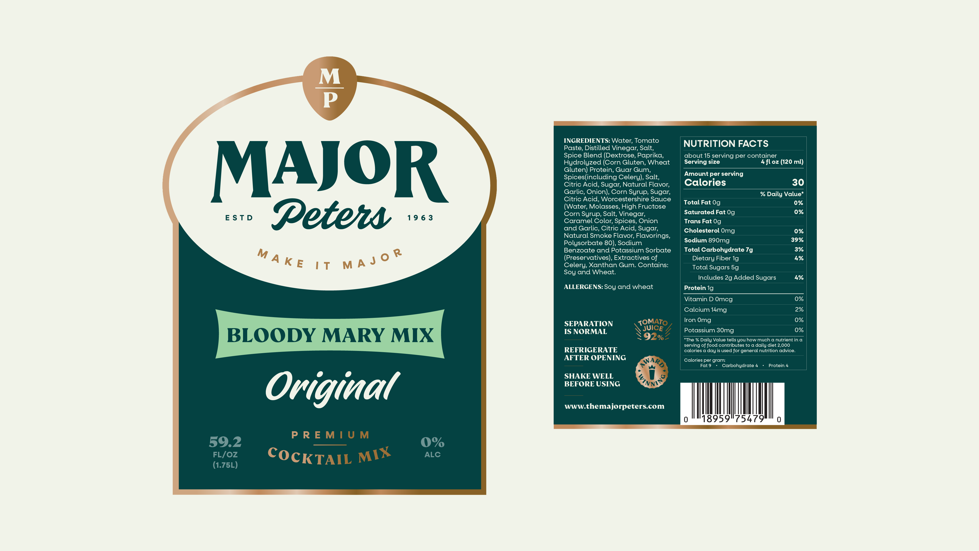
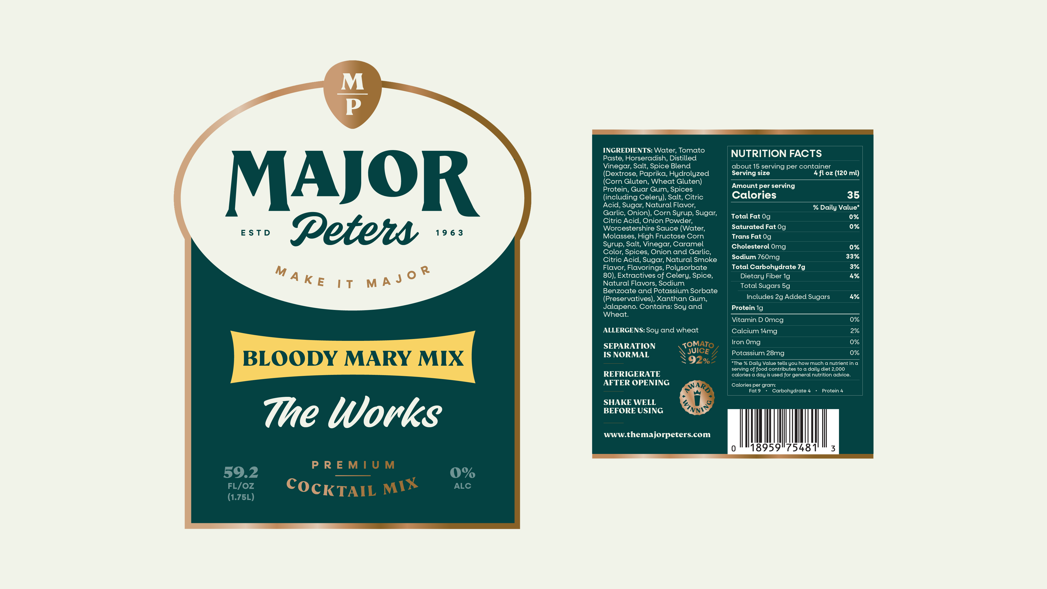
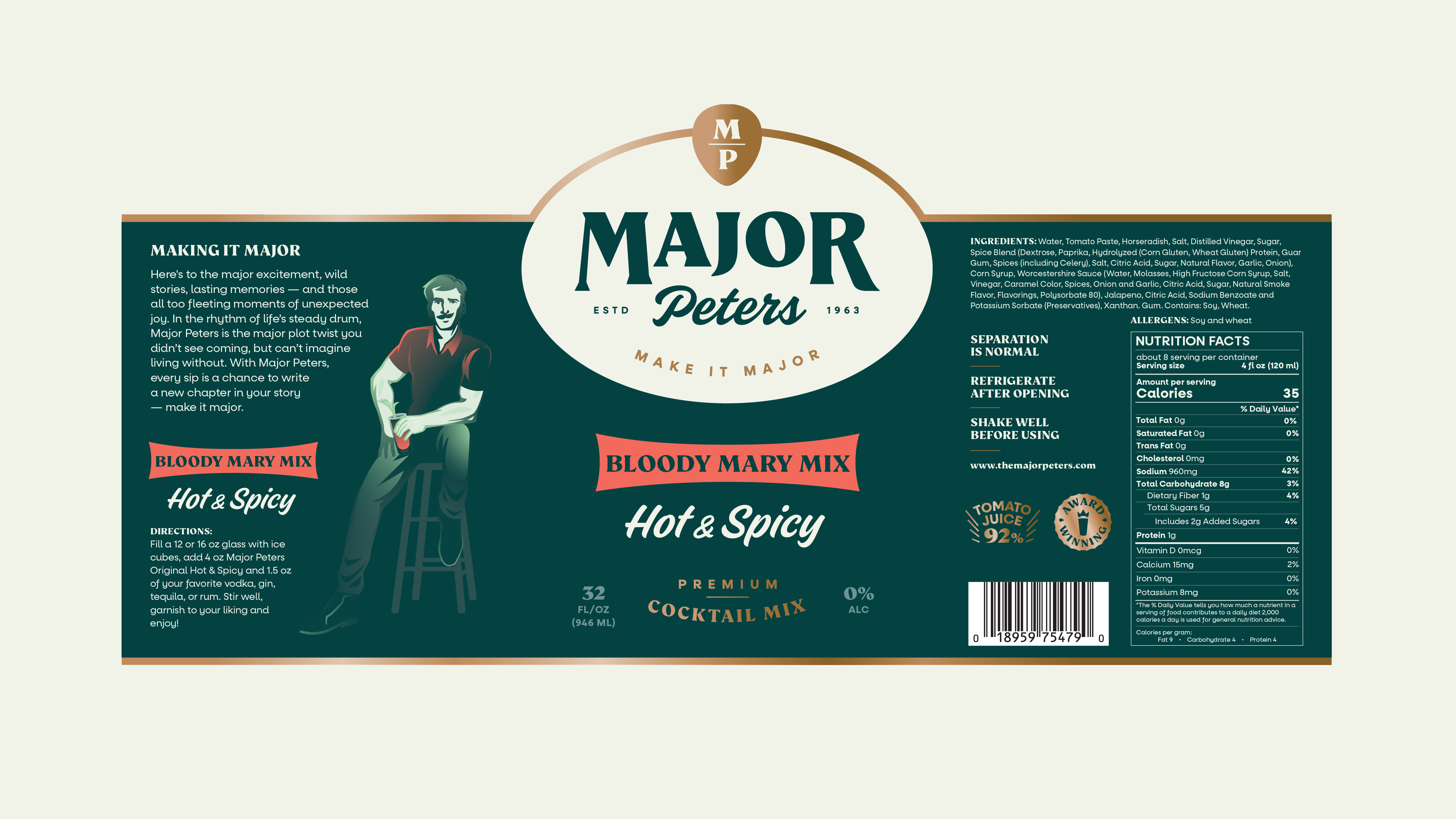
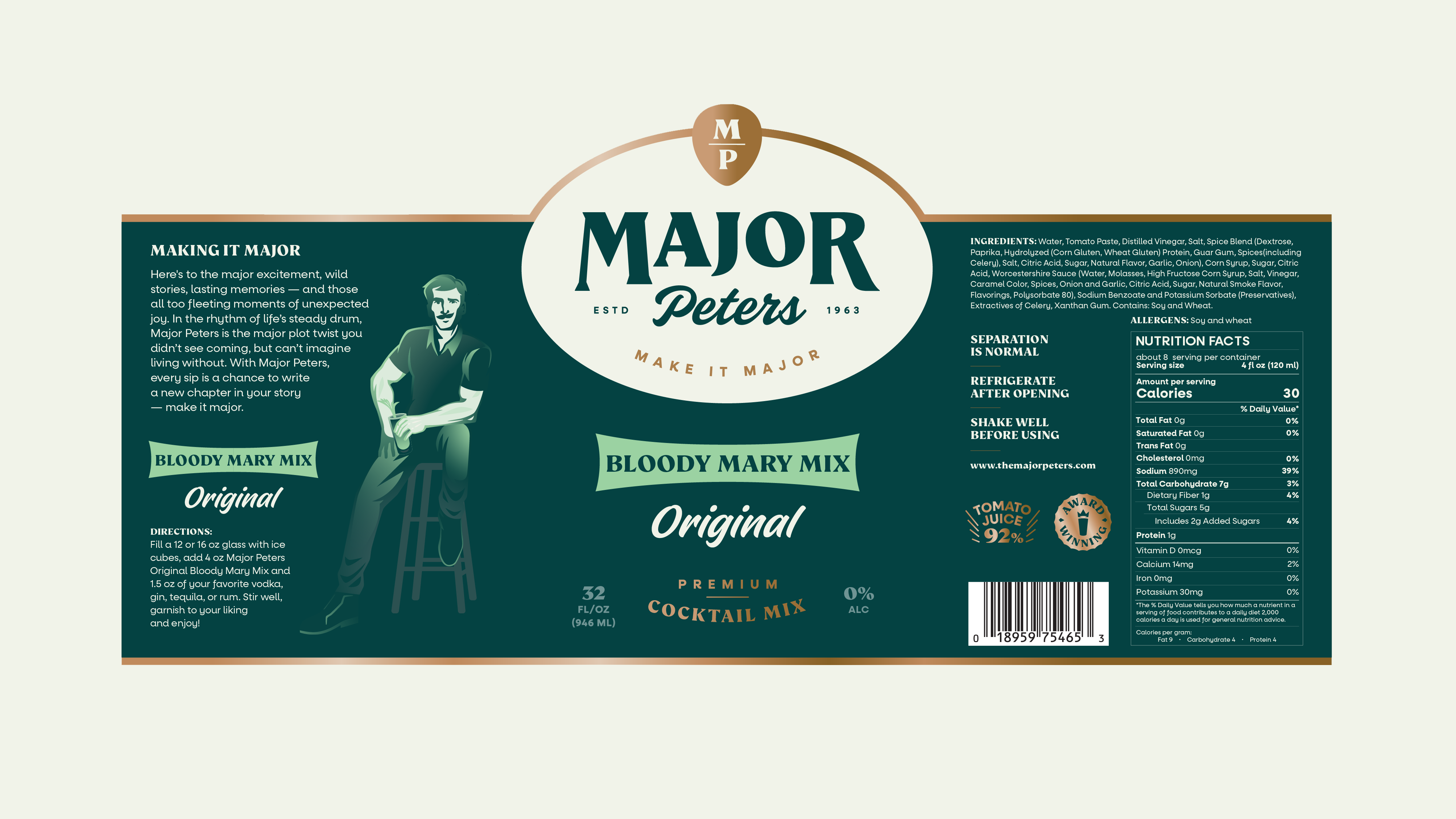
Informed by consumer research and category analysis, we transformed Major Peters from a military figure into two complementary brand expressions: a simplified brand icon for packaging and retail presence, and a fully realized adventurous character who drives brand messaging and storytelling. This dual approach allows us to maintain a clean, modern aesthetic on shelf while creating rich, engaging brand communications. We created a fresh logo that nods to heritage while embracing modernity.
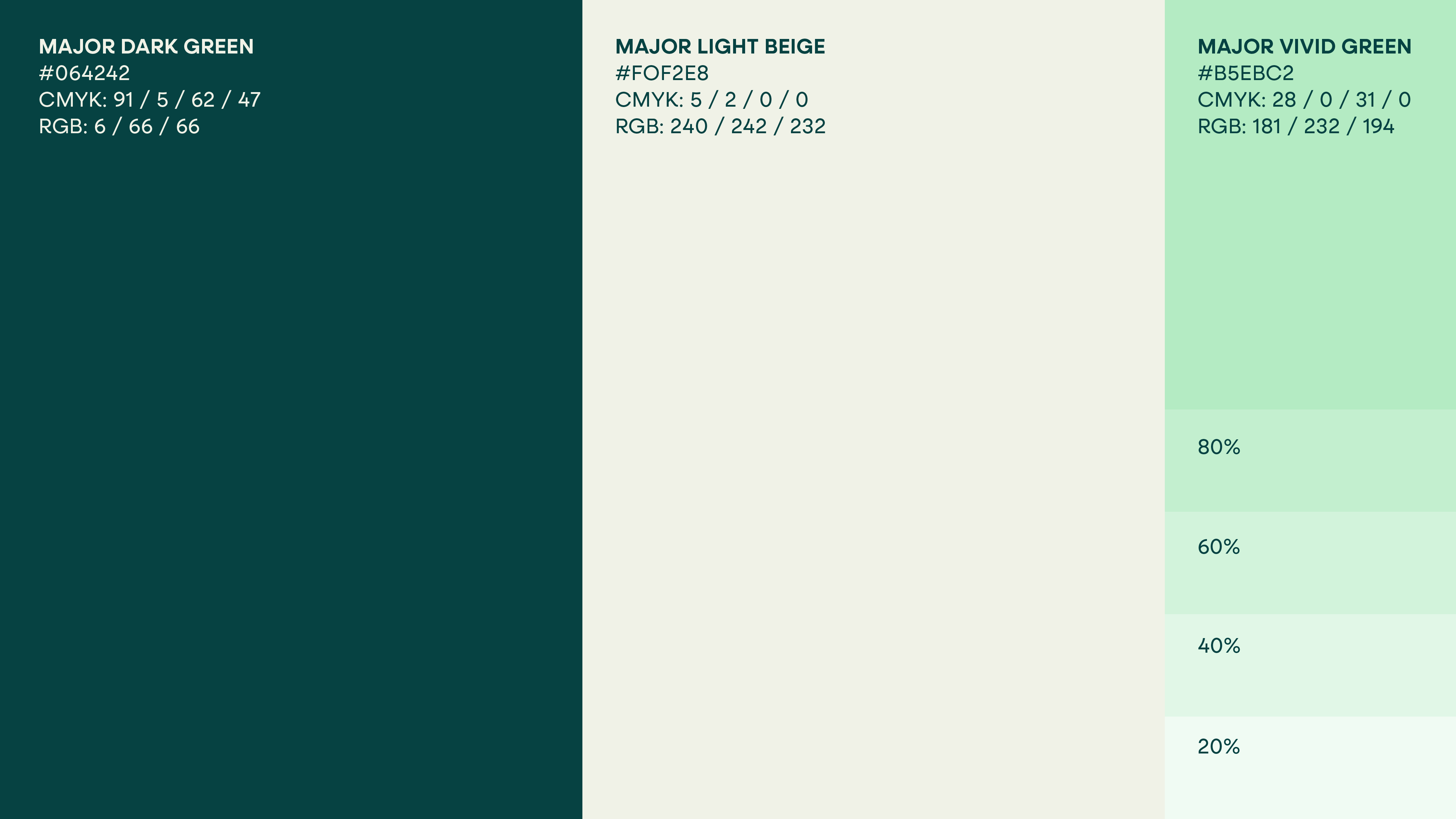
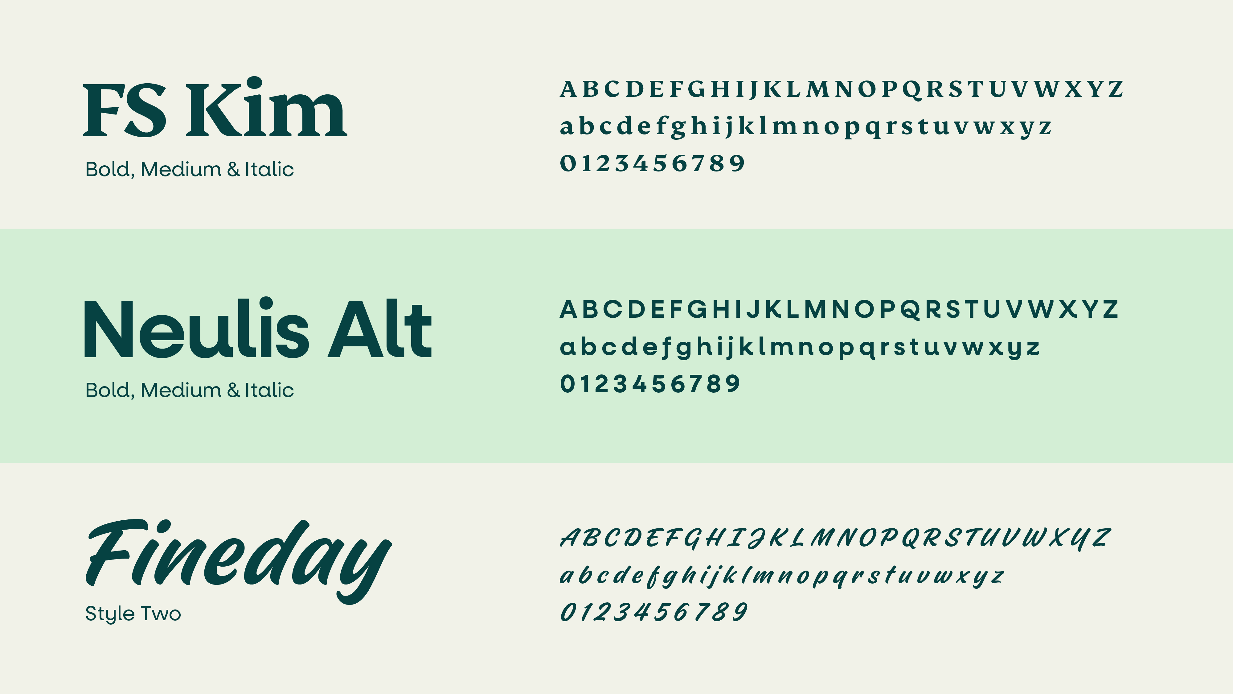
Bold, vibrant colors now pop on shelves and screens, complemented by playful icons and illustrations that bring the brand’s adventurous spirit to life. The new typography balances premium quality with approachability. Together, these elements form a cohesive visual identity that’s unmistakably Major Peters: bold, fun, and ready to make any moment major.


Speaking Major:
A New Brand Language
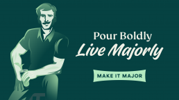
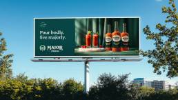
Based on extensive communication testing, we crafted a distinctive voice for Major Peters that expresses its new positioning. The tagline “Make It Major” reflects the brand’s promise to elevate everyday moments. The tone of voice we developed is bold, friendly, and adventurous with a touch of humor, bringing the Explorer archetype to life in every communication.
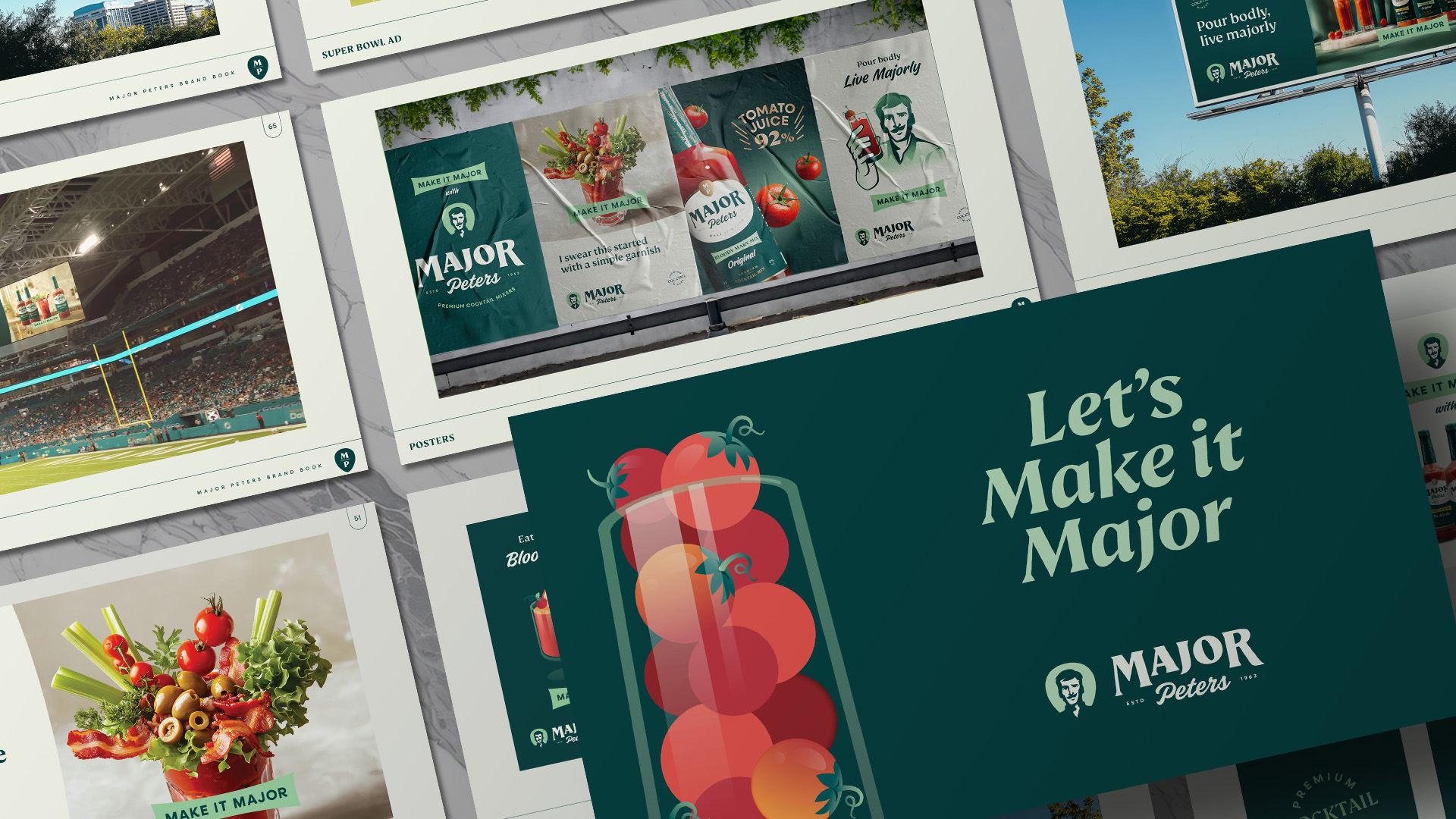
Key messages like “Pour Boldly, Live Majorly,” “When you’re ready for the major league,” and “It’s brunch o’clock somewhere” were crafted to resonate with our target audience. These phrases invite consumers to see Major Peters as more than just a mixer – it’s a lifestyle choice that transforms ordinary moments into major experiences.


Crafting the First Impression:
Packaging with Purpose
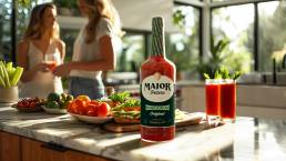
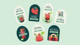
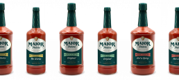
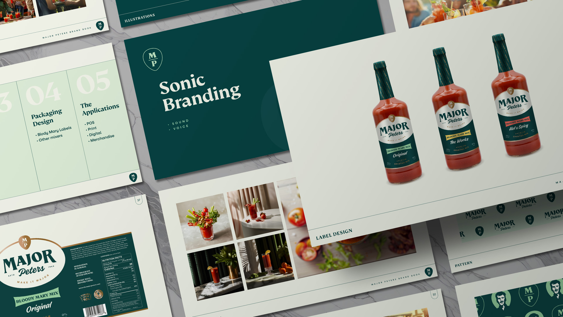
Our packaging redesign, guided by shopper insights and retail environment analysis, aimed to increase shelf appeal and communicate the brand’s premium quality. We retained the eco-friendly glass bottle and prominently highlighted the 92% high-quality tomato paste content. The new design showcases bold flavors through vibrant imagery and clear communication.

Making it Real:
From Strategy to Shelf
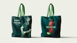
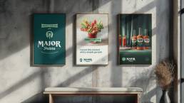
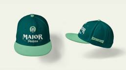
Following extensive stakeholder collaboration, we rolled out the new brand identity across various touchpoints, including product packaging, social media platforms, and point-of-sale materials. Marketing collateral was redesigned to reflect the new brand identity, consistently communicating the “Make It Major” message. We created comprehensive brand guidelines to ensure consistent application across all touchpoints.
Major Momentum:
Growing Beyond Expectations
Initial feedback has been overwhelmingly positive. Most significantly, Major Peters has secured nationwide distribution through one of America’s largest grocery retailers, marking a major milestone in the brand’s growth strategy. The brand is successfully attracting attention from both existing customers and new target segments.
We’re seeing growing interest from additional retailers and distributors, particularly in brunch spots, tailgating venues, and locations catering to day-drinking crowds. These early indicators suggest that Major Peters is well on its way to achieving its ambitious growth targets and becoming a go-to choice for quality and innovation in the Bloody Mary experience.

Conclusion
The Major Peters rebrand represents a bold step towards becoming a category challenger in the mixer market. Through deep strategic thinking, consumer understanding, and creative innovation, we’ve transformed a traditional brand into a modern icon. By embracing its authentic Midwestern roots and infusing them with a spirit of adventure, Major Peters is poised to make every moment major for a new generation of consumers. This comprehensive rebrand has laid a strong foundation for the brand’s future growth, setting the stage for Major Peters to revolutionize the Bloody Mary experience and achieve its market share goals.
Better Clients
“The Cubic Orange team did an amazing job restaging our 50-year-old beverage brand. They gave the imaging, packaging, and brand story a complete makeover re establishing the brand’s relevance with consumers. I was amazed at the speed with which they completed the re positioning and the creativity they brought to bear in developing an innovative, practical, and consumer-oriented solution that was ready for immediate execution. We will continue to use Cubic Orange to help us improve the performance of our entire brand portfolio.”
CHRIS LISCHEWSKI
President, Golding Farms Foods, LLC