HOLLY DRIVE
LEADERSHIP ACADEMY
Client
San Diego Unified School District & Studio WC Architecture & Engineering
Deliverables
Visual Identity System, Signage & Wayfinding, Environmental Design
Year
2025
Overview
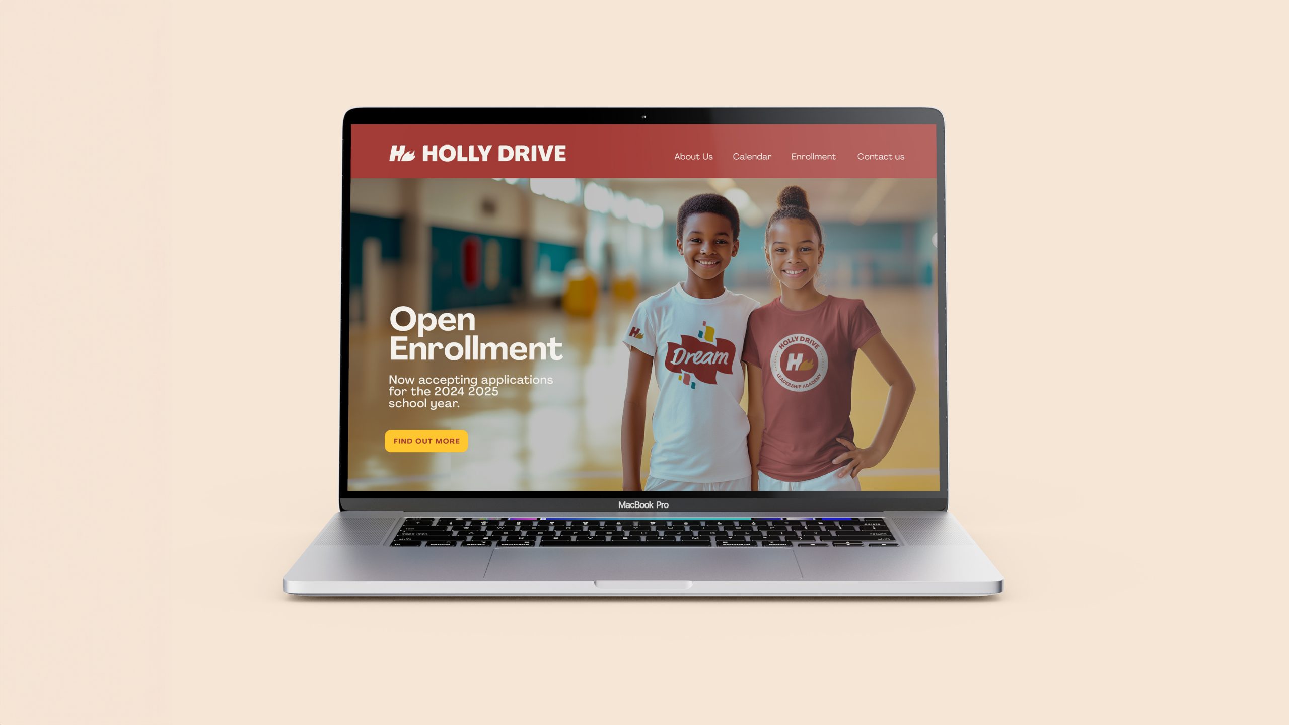
As part of San Diego Unified School District’s whole-site modernization program, Holly Drive Leadership Academy partnered with Cubic Orange to create a new brand identity that reflects its renewed sense of purpose and optimism. The school wanted to preserve its iconic “H with flame” symbol while evolving it into a more unified, flexible, and contemporary design system that could extend seamlessly across signage, print, and environmental graphics.
Our goal was to build a bright, cohesive visual language that communicates warmth, creativity, and leadership, transforming the campus into a place where students can grow, explore, and thrive.
Challenge
The existing brand lacked consistency and scalability. Its flame motif felt aggressive and dated, and visual applications across the campus varied widely. The challenge was to honor the school’s legacy mark while giving it new life through simplicity, balance, and modernity — a design that could feel timeless, inclusive, and full of energy. We also needed to ensure the new system worked across all touchpoints, from uniforms and school materials to large-scale wayfinding and environmental installations, maintaining both clarity and character in every format.
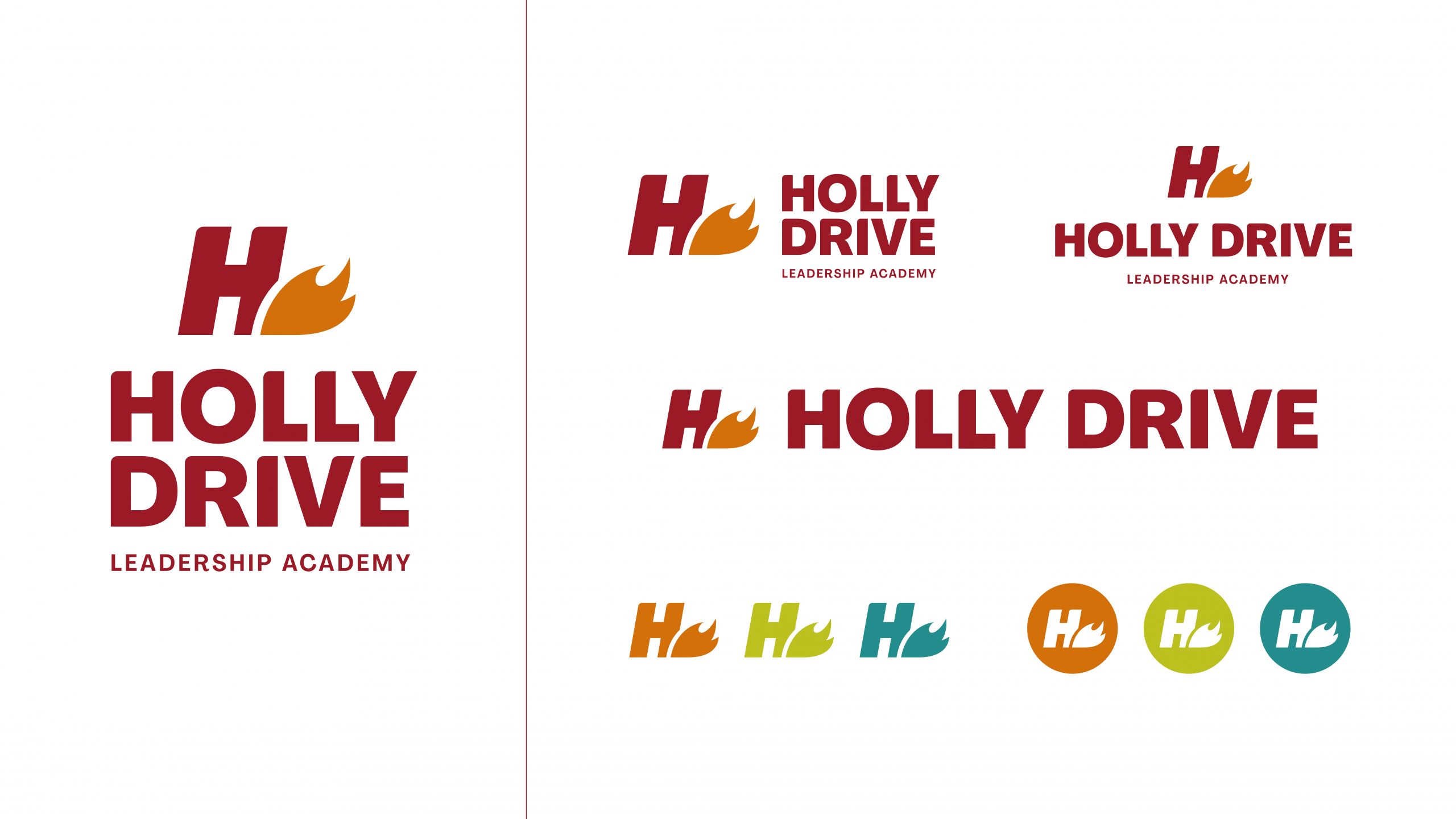
Visual Identity System
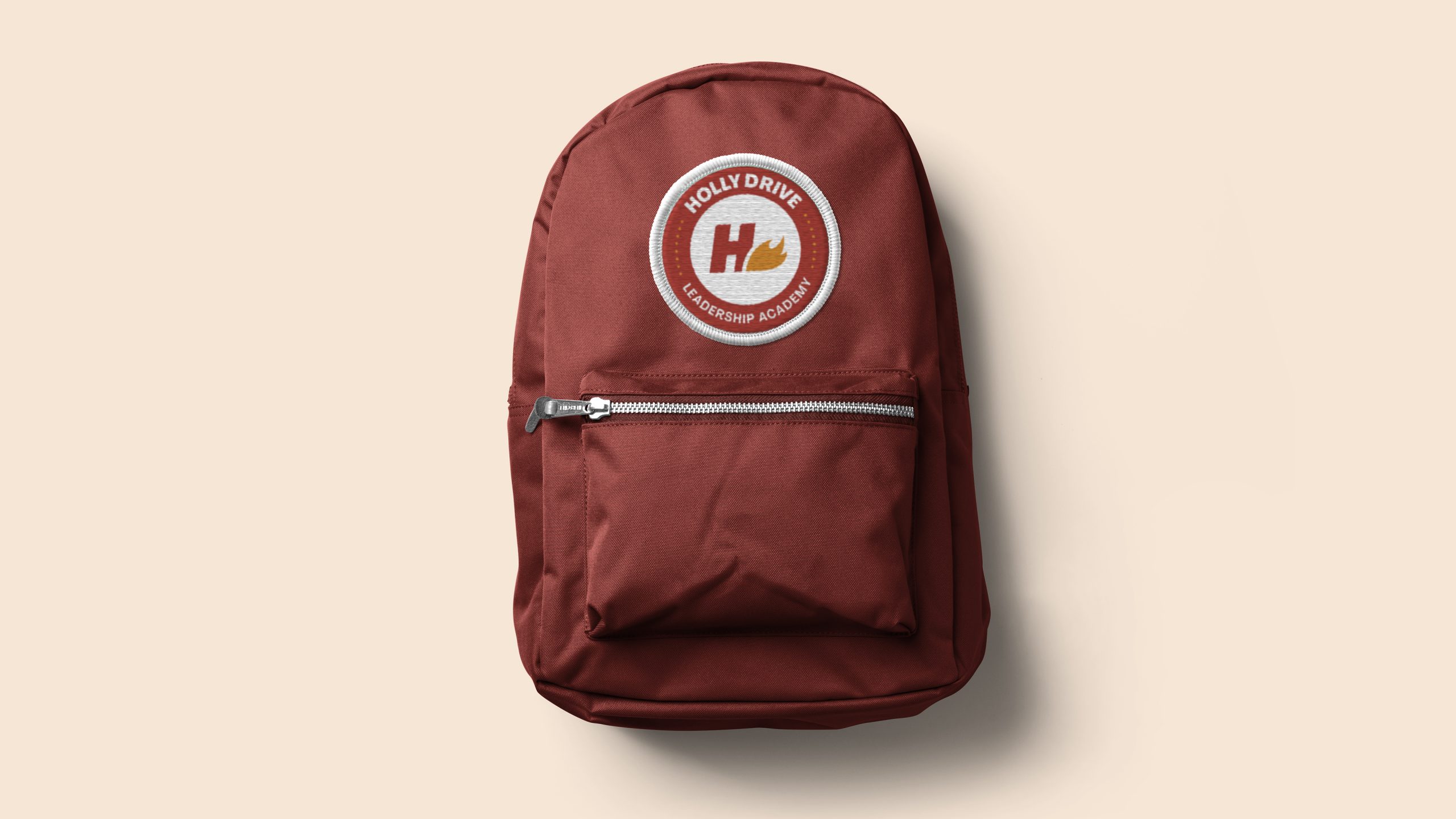
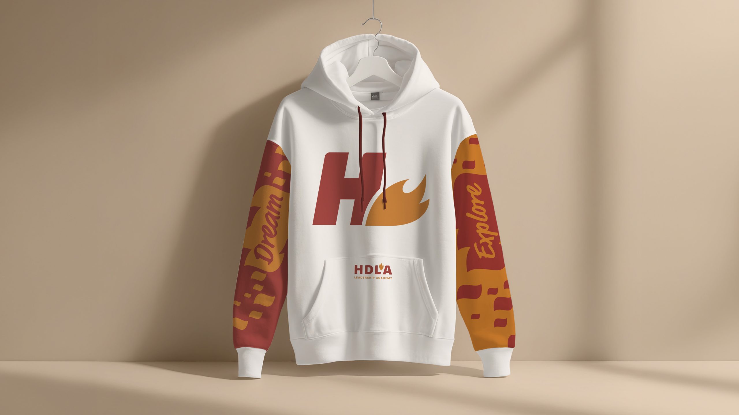
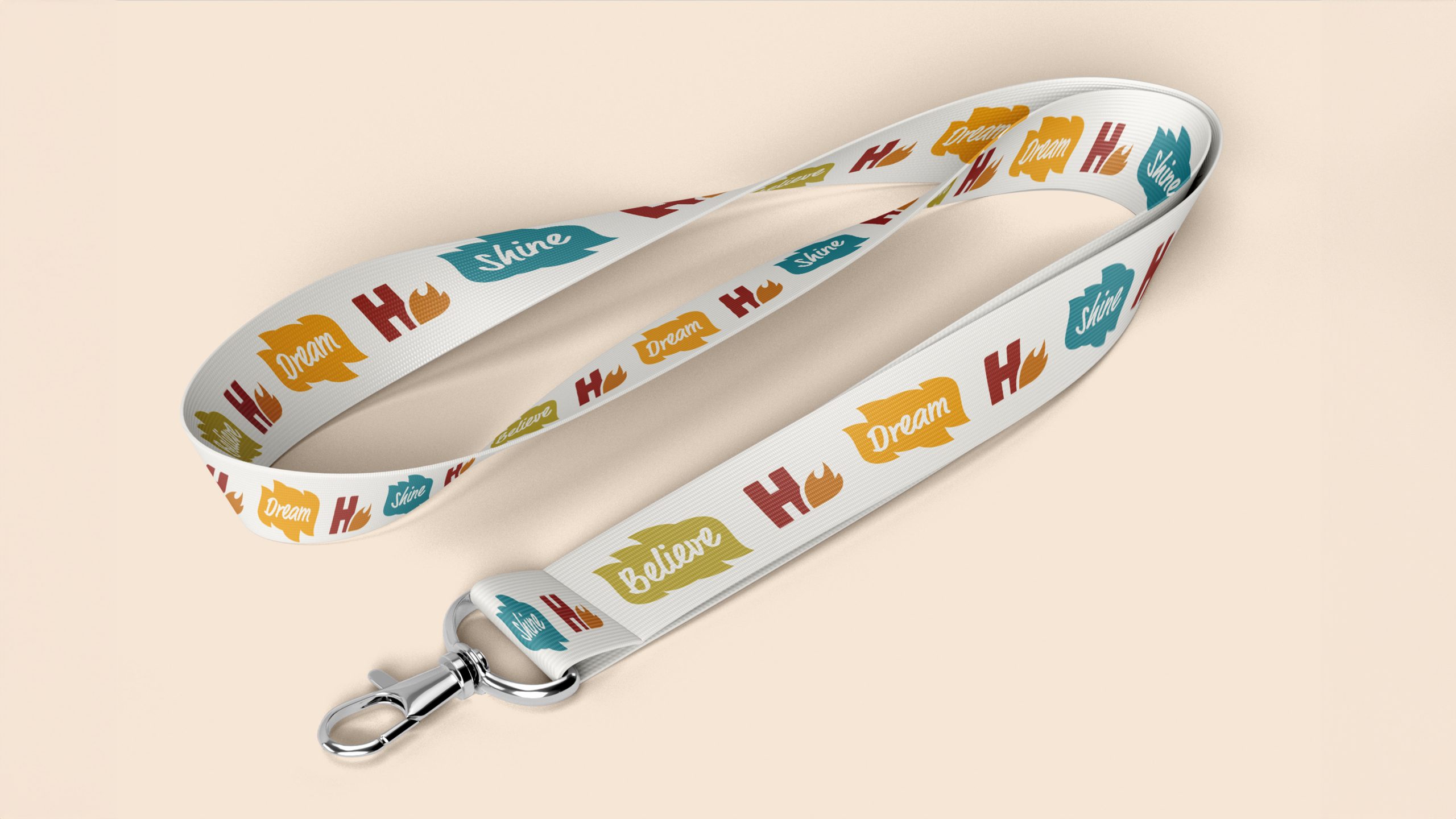
At the heart of the new identity is a redesigned H flame icon, simplified, rounded, and more fluid, representing both the light of knowledge and the warmth of community. The flame’s curves became the foundation of the entire system. They inspired custom pattern shapes used throughout the visual language, linking every element back to the school’s emblem.
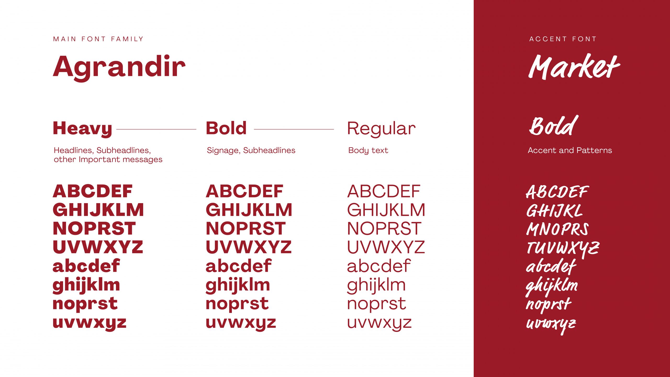
Typography follows the same principle. The sans-serif typeface reflects structure and modernity, while the script font introduces rhythm and movement, echoing the natural motion of the flame. Together, they bring balance between academic discipline and joyful self-expression.
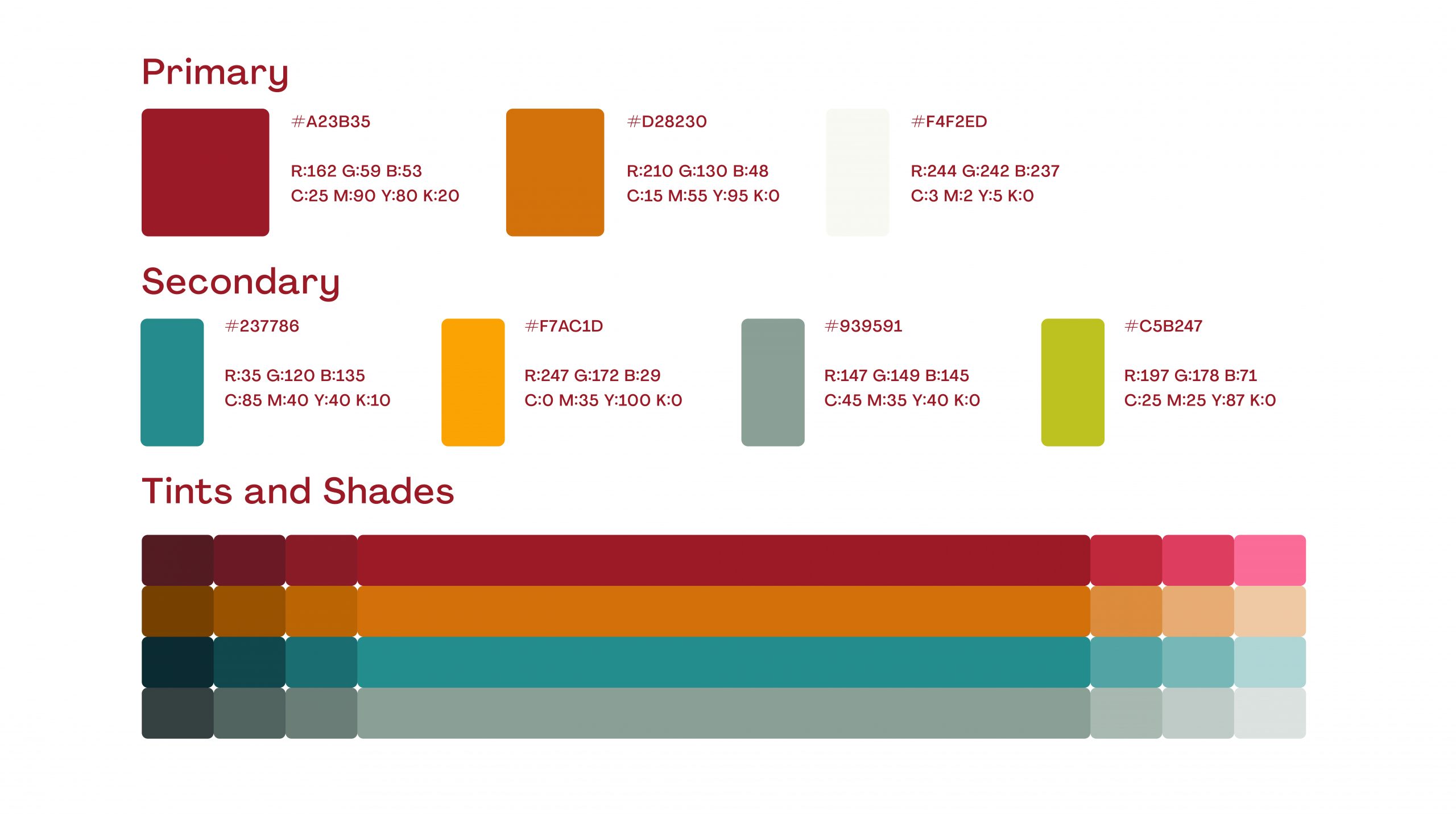
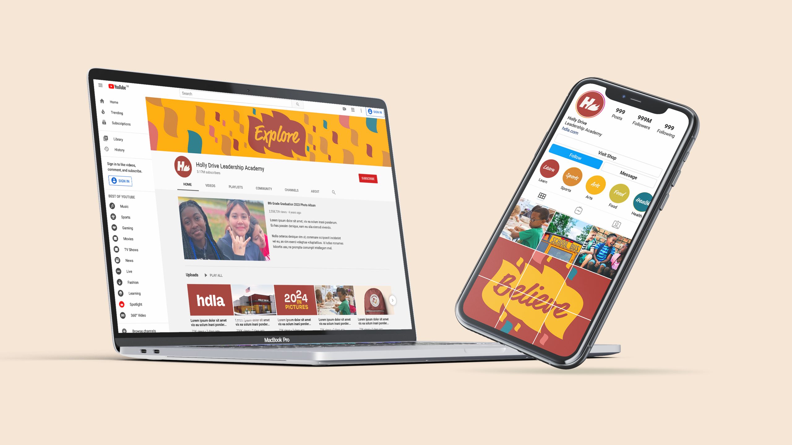
The color palette builds on the school’s heritage red and introduces a vibrant yellow to symbolize optimism and confidence. Supporting hues of blue and lime green add diversity, freshness, and approachability. This chromatic range creates a space that feels open, optimistic, and alive, mirroring the school’s educational vision
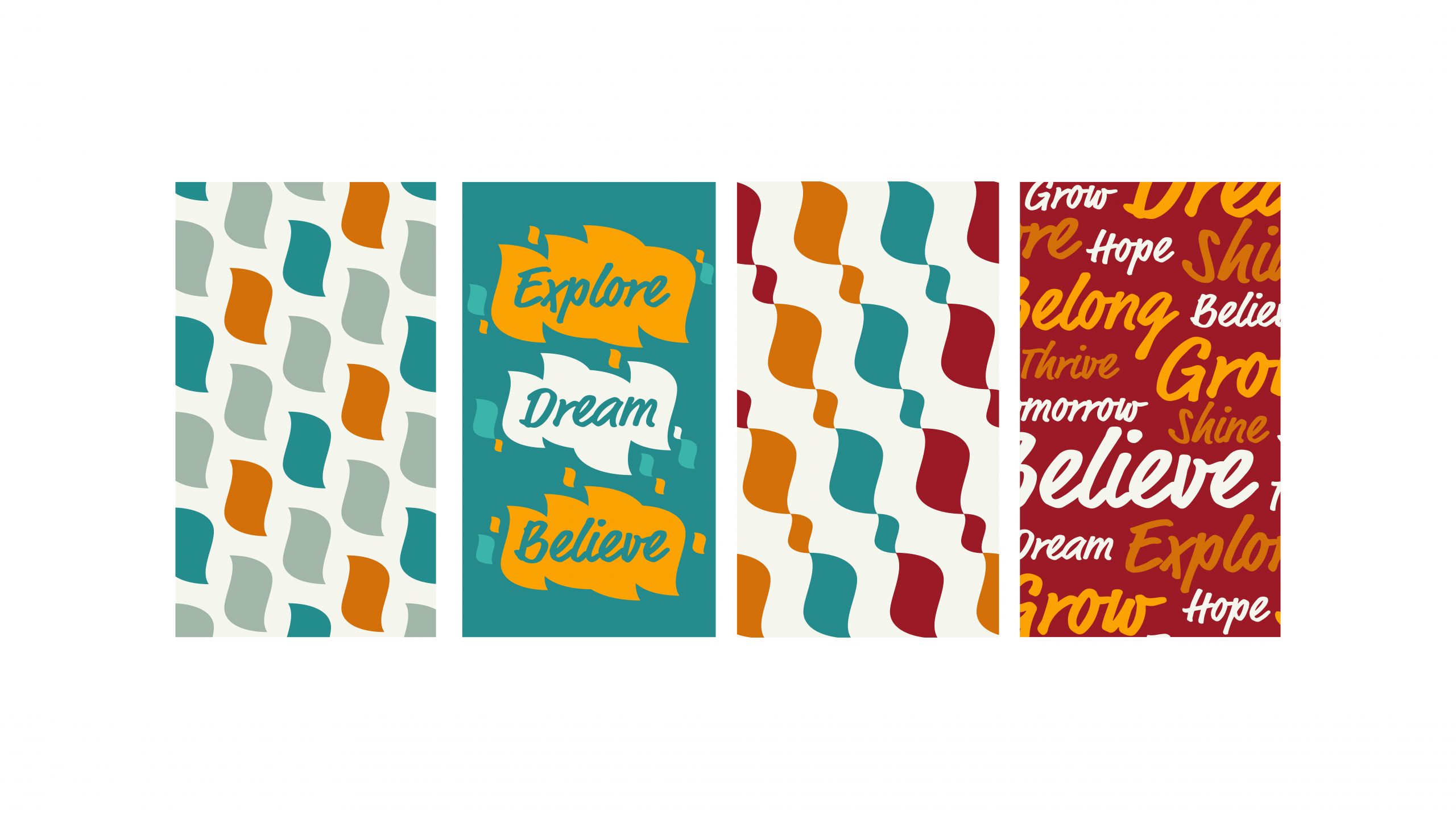
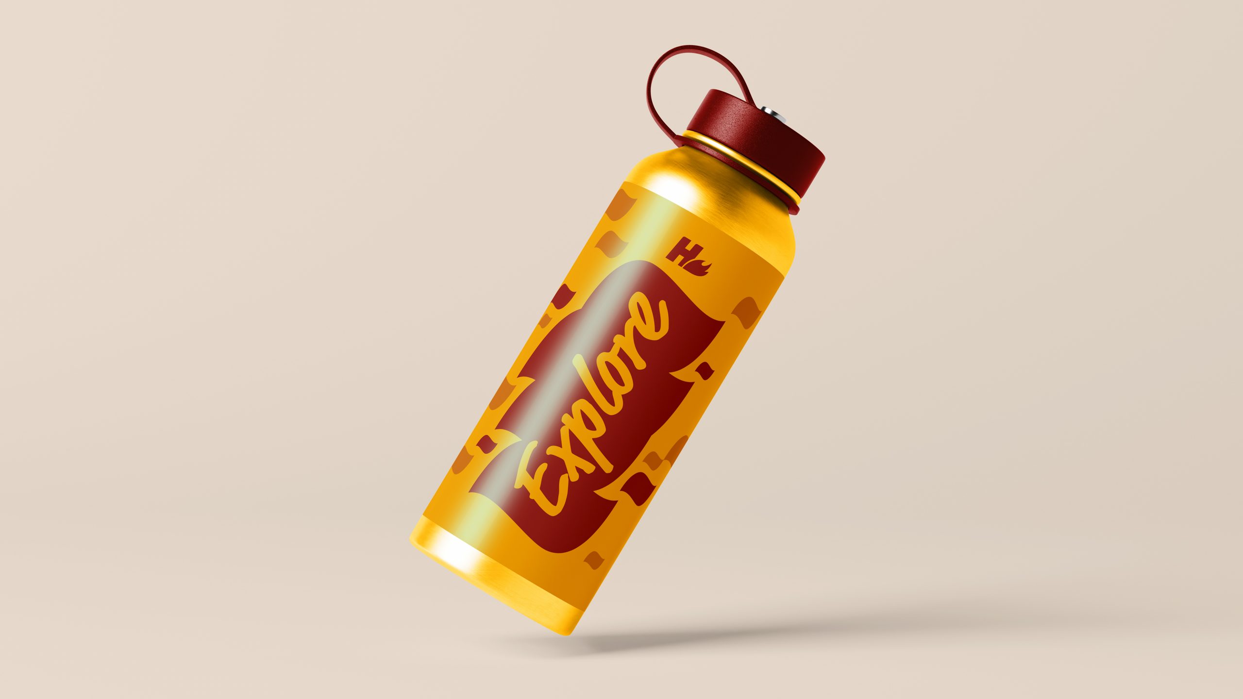
Patterns and Shape Language
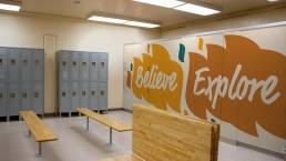
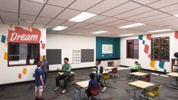
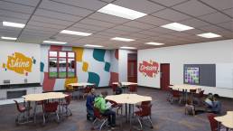
We expanded the visual identity into a dynamic pattern system that extends the flame’s shape language across banners, walls, and signage. The patterns incorporate uplifting words like Believe, Grow, Explore, and Shine, transforming static surfaces into motivational touchpoints that students encounter every day. By weaving the logo’s geometry into patterns, typography, and environmental layouts, the system feels inherently connected, every piece part of one story.
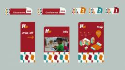
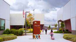
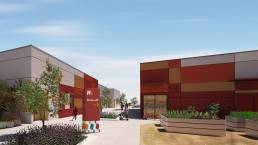
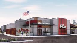
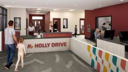
Signage and Environmental Design
Cubic Orange designed a full signage and wayfinding system that’s both functional and engaging.Each sign combines legibility with playful rhythm, using bold headers, generous spacing, and colorful accents drawn from the pattern language. Vertical signs place information high for visibility while grounding the base with pattern blocks that echo the flame. Horizontal signage continues this balance, ensuring harmony across all architectural scales. Environmental mockups visualize how the identity expands through the campus, from classroom doors and directional markers to murals and common spaces, creating a vivid, story-driven experience that feels distinctly Holly Drive.

Outcome
The new Holly Drive Leadership Academy identity is bright, modern, and deeply connected to its heritage. By reimagining the flame as a symbol of possibility rather than intensity, and by extending its form into every design layer from type and color to signage and patterns, the school now has a visual system that communicates leadership, optimism, and unity.
Cubic Orange’s story-first approach turned a legacy mark into a living identity system, one that fuels school pride and transforms the learning environment into an everyday source of inspiration.
Better Clients
"We had a great experience working with this team. They were patient, communicative, and supportive throughout every step of the design process. They turned projects around quickly and delivered beautiful, thoughtful work. We're excited to continue collaborating with them on future projects!"
ANA CORREAL
Project Manager, Studio WC Architecture + Engineering